Yellowstone Advisors. We designed and built Yellowstone Advisors’ website.
The challenge
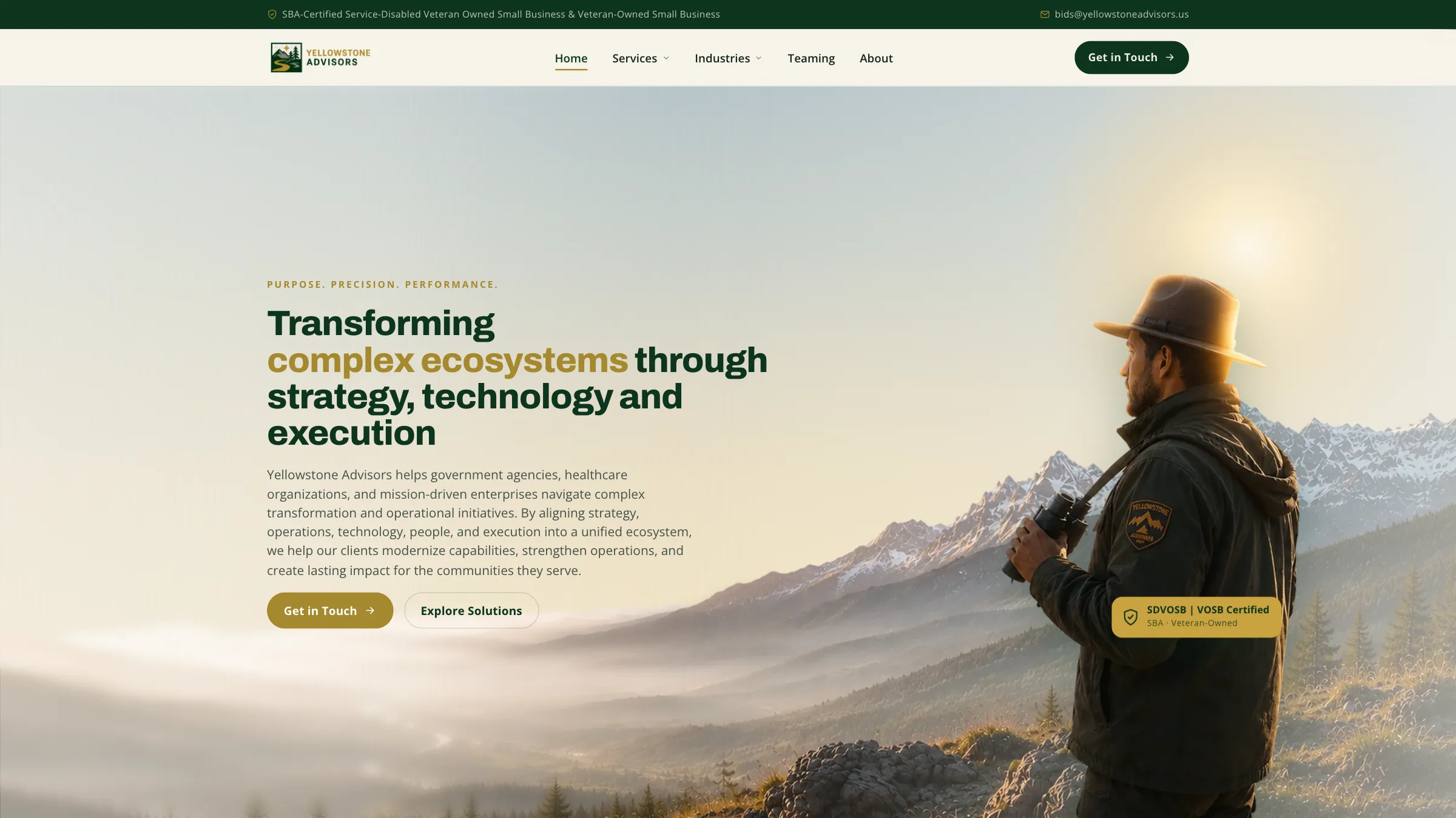
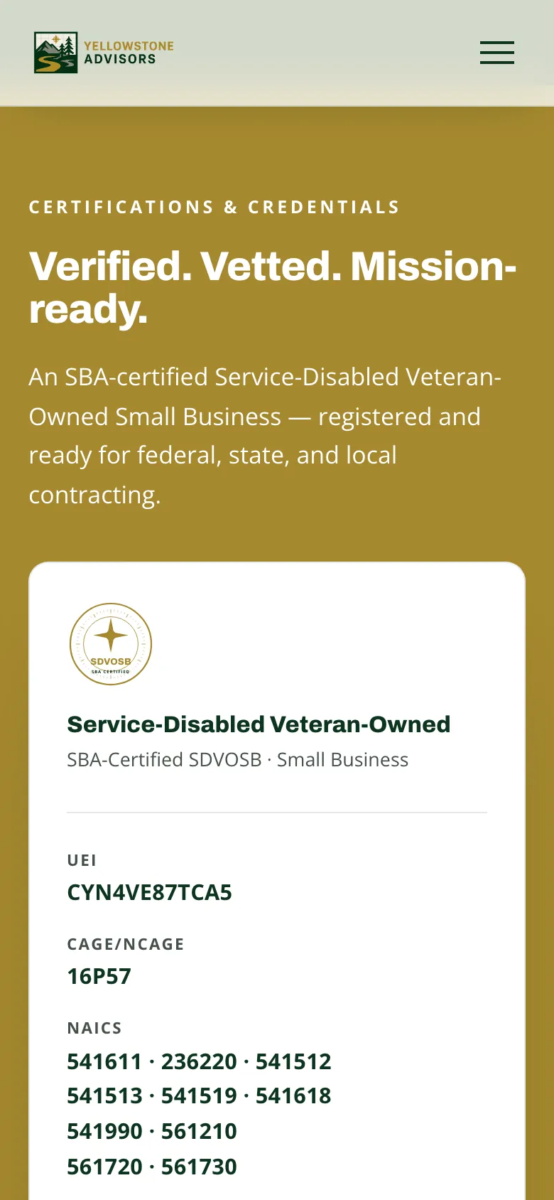
Yellowstone Advisors presents advisory services to government agencies and prime contractors. The website needed to explain its capabilities and make registration details easy to locate alongside the work it offers.
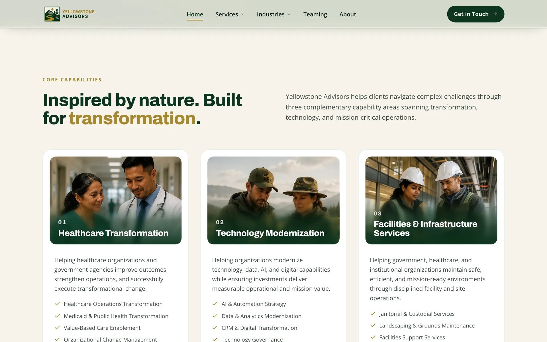
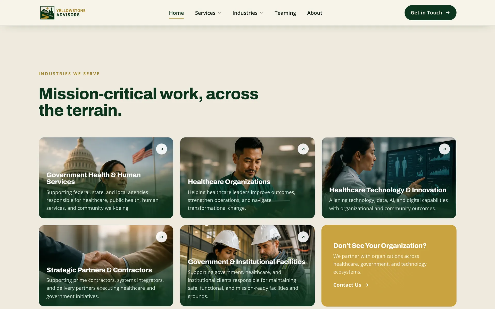
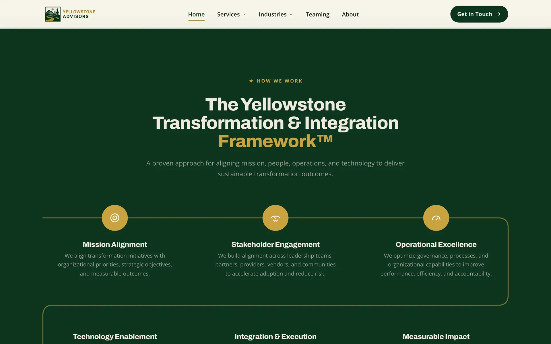
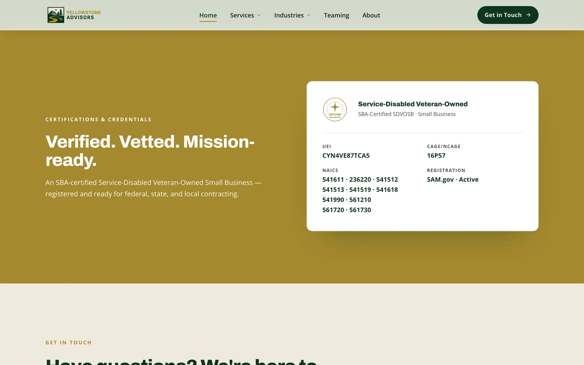
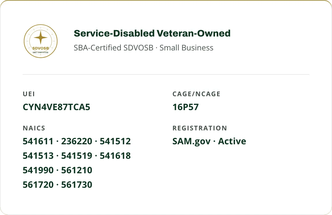
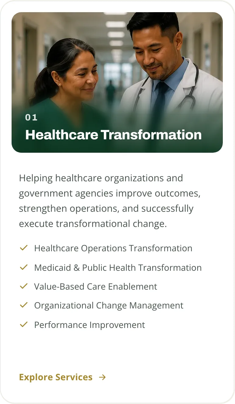
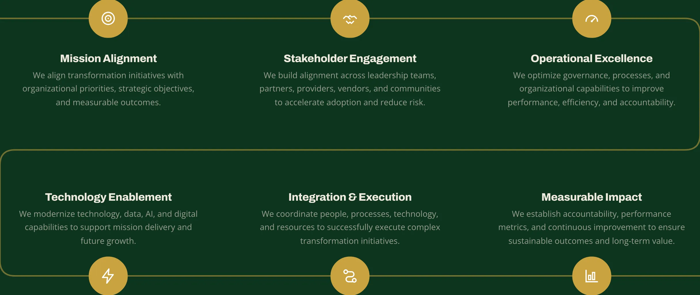
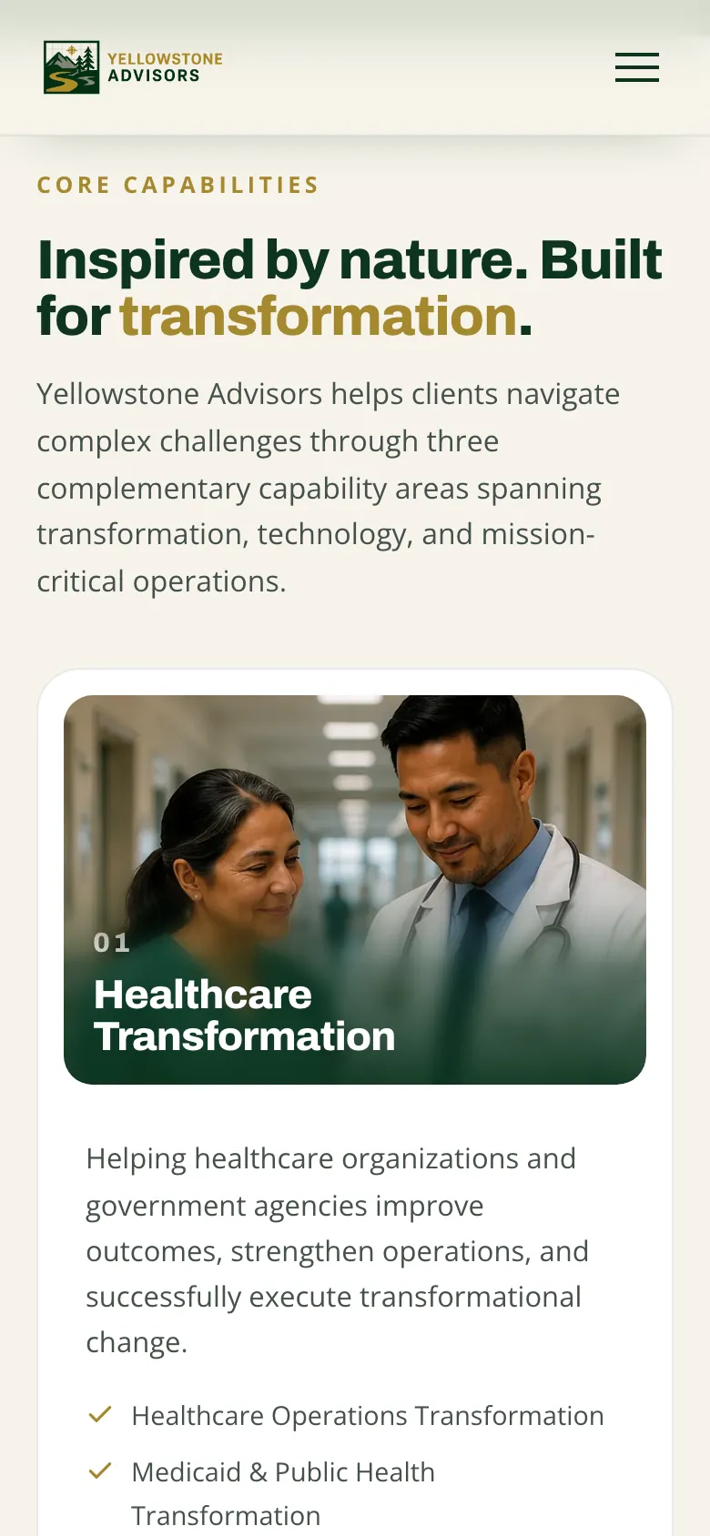
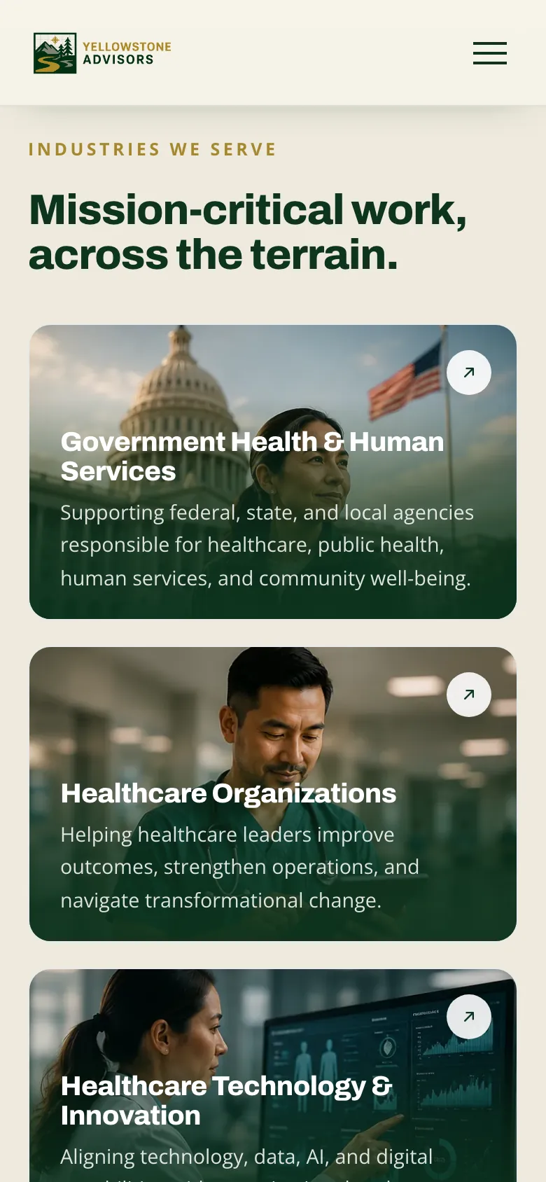
We designed the page hierarchy, landscape imagery, service cards, and credential layouts as one system. The presentation gives services room to explain the offer while keeping the firm’s identity and registration information close at hand.
- Public pages in the documented scope
- 10
- The local website README lists ten public routes. This is implementation scope, not a launch or usage result.
- Service lines
- 3
- Healthcare, technology, and facilities, each with a page of its own.
- Golds, down from five
- 2
- Eight greens became four, and nine off-whites became three.
We connected the visual identity to the firm’s origin.
Art direction
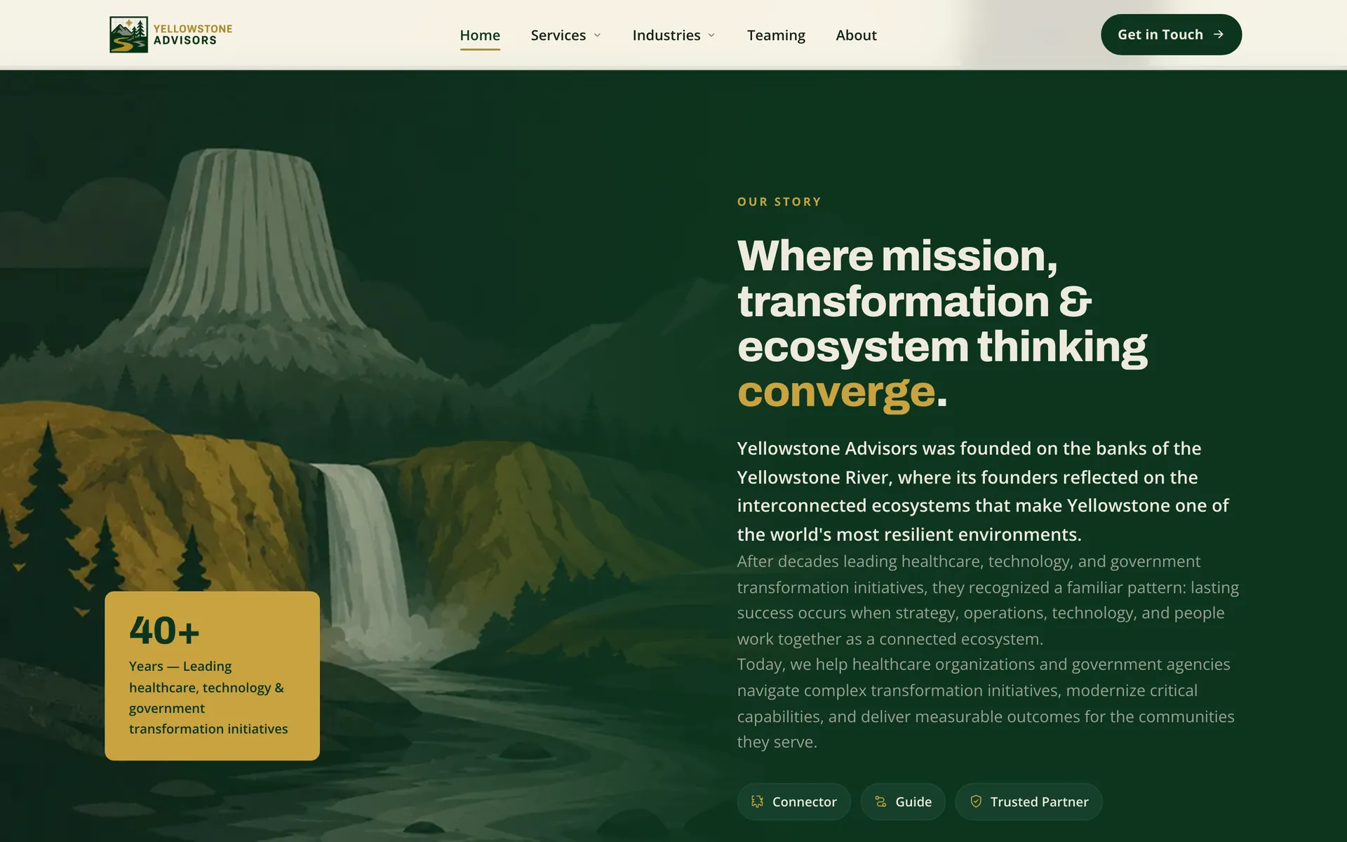
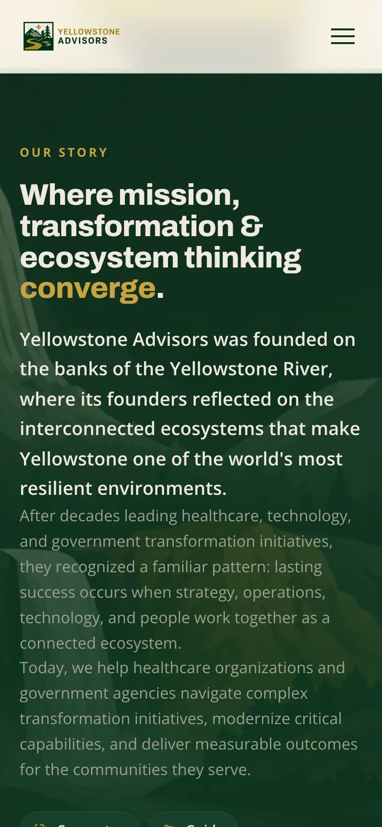
The firm’s story begins beside the Yellowstone River. Landscapes carry that origin into the website: a valley introduces the firm, a waterfall accompanies its story, and forest green, gold, and paper connect the sections.
We separated brand colors from their interface roles.
Design system
The design-system audit found the same pale green used for dividers, hover fills, and textures. We separated those roles so each could change with its background. The documented palette consolidation reduced five golds to two and eight greens to four.
Color
Forest
The brand green, from the darkest card to the hairline on dark.
- Dark card#0D2719
- Forest#0D351F
- Raised#15402A
- Line#1E4D33
Gold
Two golds where there used to be five.
- Gold#A5882E
- Bright gold#C9A23F
Paper and ink
Warm neutrals for pages, lines and text.
- White#FFFFFF
- Paper#F6F3EA
- Cream#EFEADE
- Stone#D8D6C9
- Sage#757A6B
- Ink soft#44514A
- Ink#16241C
Type
Archivo
800
Purpose. Precision. Performance.
Headings
Open Sans
400
Strategy, technology, and execution.
Body text
- Heading 159px
- Heading 246px
- Heading 324px
- Large19px
- Body15px
- Small14px
- Extra small12px
We made services, sectors, and credentials distinct to scan.

We composed the landscape around the headline and credentials.
The hero
The sky, valley, ranger, and badge are separate layers. That separation lets the landscape change shape around the headline and actions while the credential keeps a distinct position in the composition.
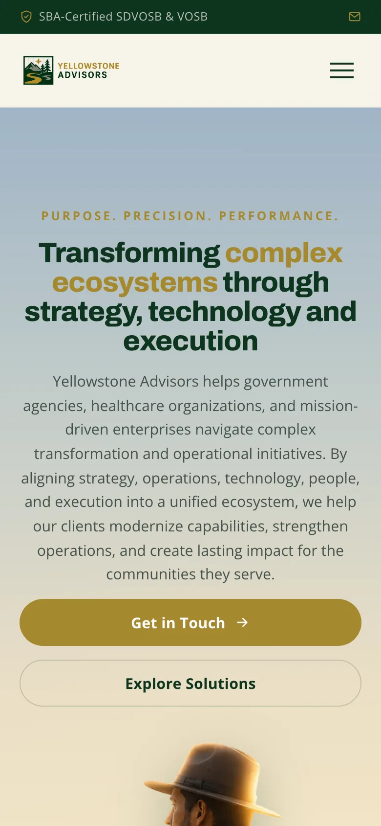
On phones, we put the message before the landscape.
Credits
Team
- reDesign Design, design system, and build
- reLabs Engineering
Built with
- Astro and GSAP
- A React admin
- Cloudflare Workers and D1
- Claude and Claude Code
Next project: Ortellis
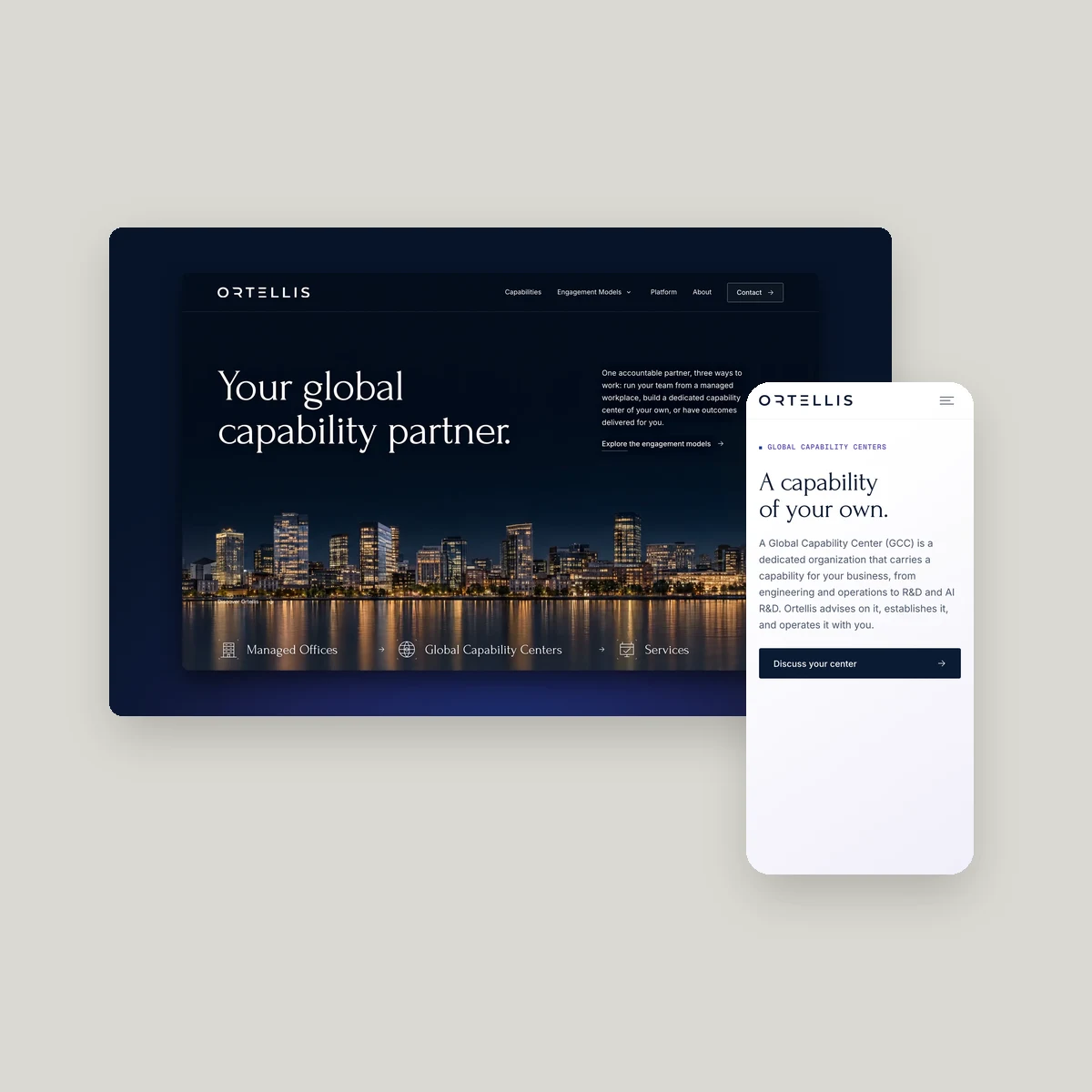 Ortellis. An identity and website connecting three ways to work with Ortellis