Ortellis. We designed Ortellis’ identity and website.
The challenge
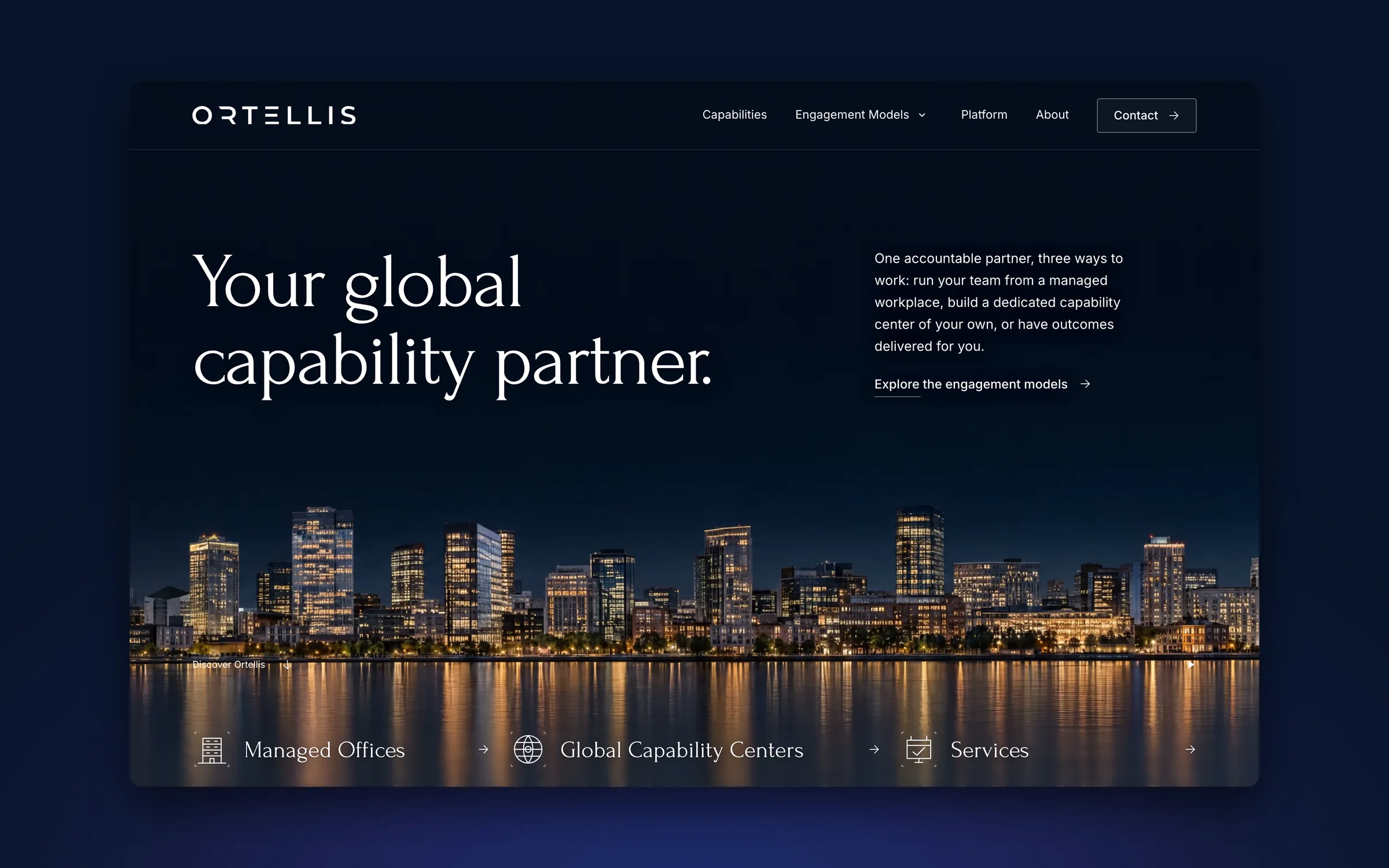
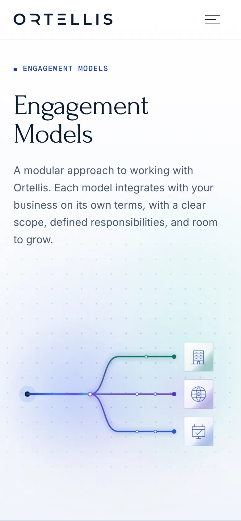
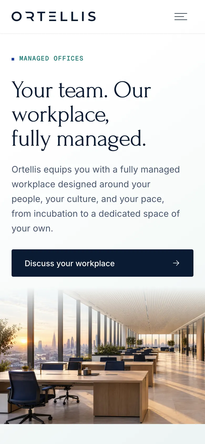
Ortellis brings Managed Offices, Global Capability Centers, and Services under one company. Its identity needed to hold those offers together; its website needed to explain how each arrangement works.
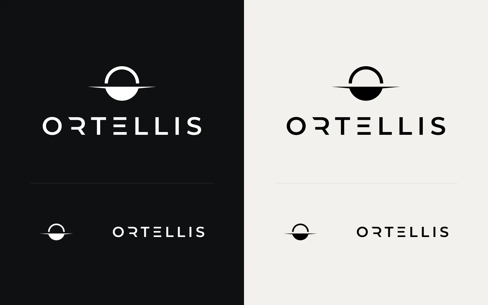
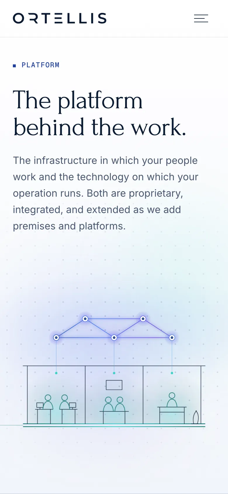
We designed the wordmark, horizon sign, and website as a connected system, then worked with reLabs on implementation. The sign’s horizontal structure carries into the imagery, diagrams, and transitions between pages.
- Engagement-model pages
- 3
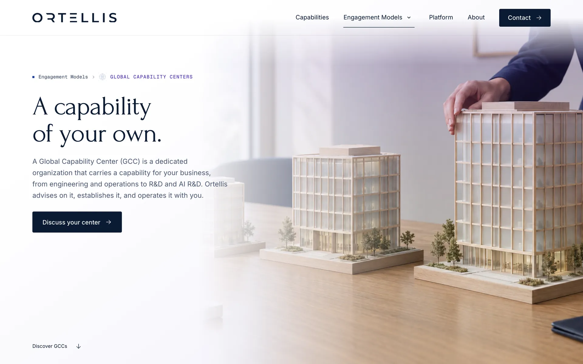
- Managed Offices, Global Capability Centers, and Services each have a dedicated explanation.
- Capabilities on one page
- 5
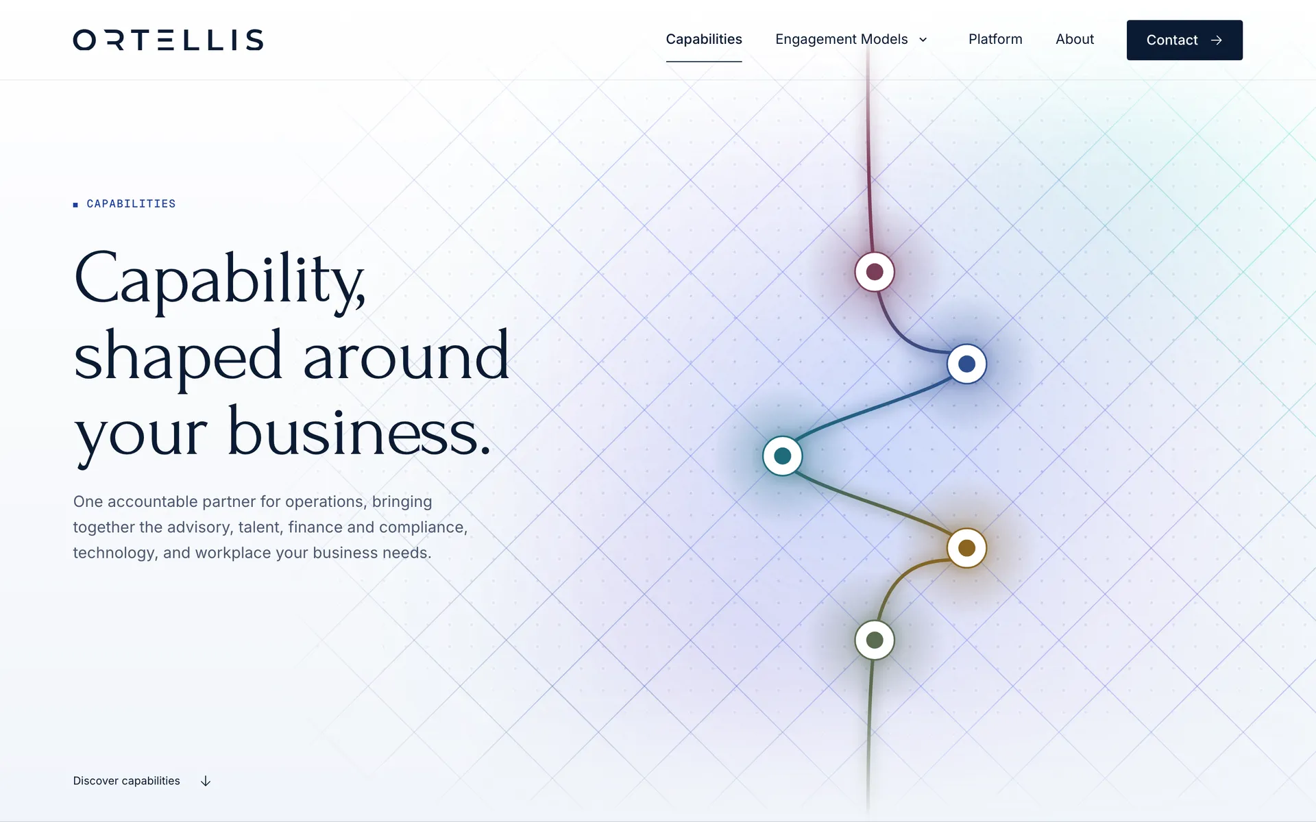
- Advisory, talent, finance, technology, and workplace, side by side.
- Numbered wordmark studies
- 20
- The identity archive contains numbered studies 1–20. This is exploration scope, not a count of client review rounds.
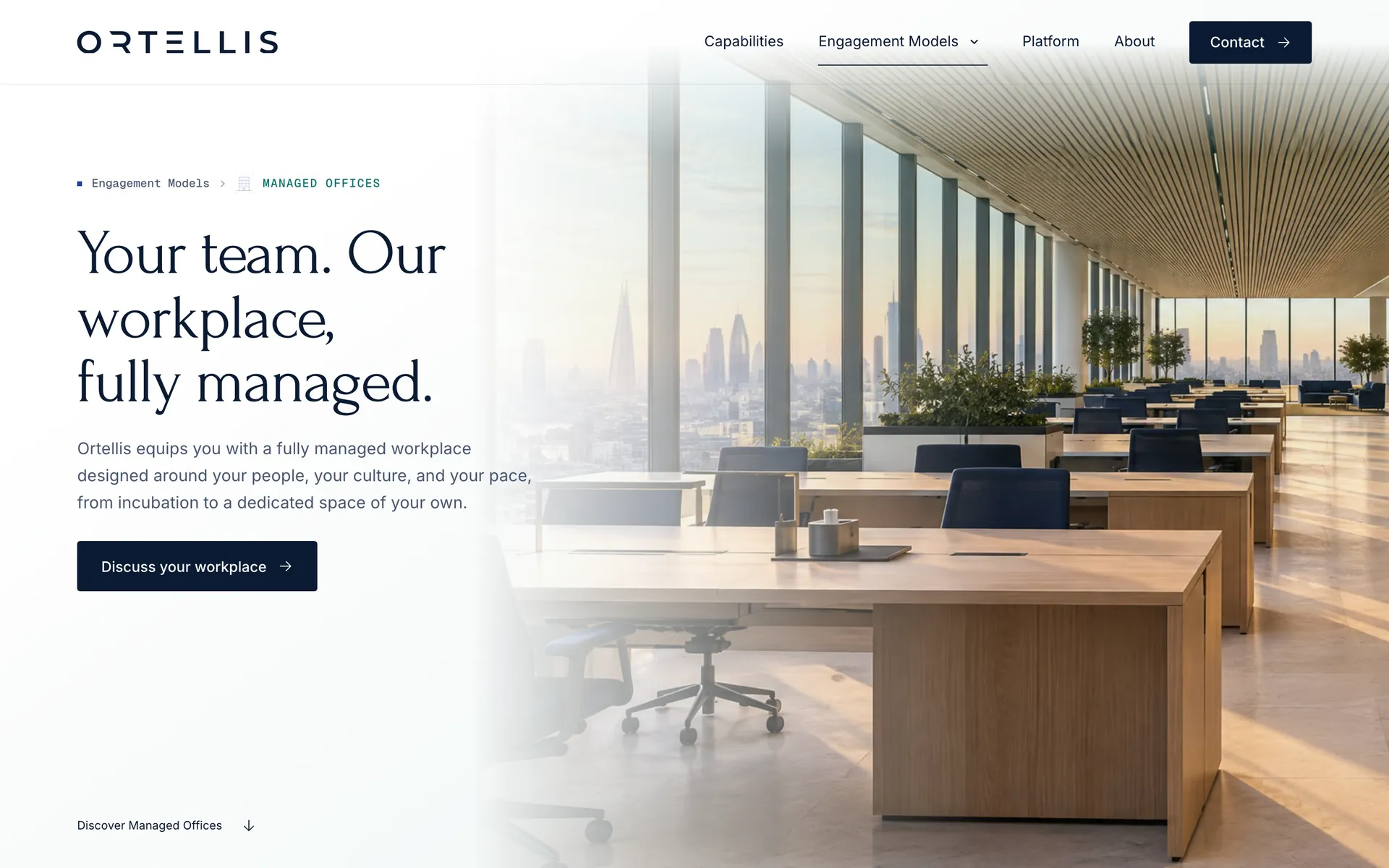
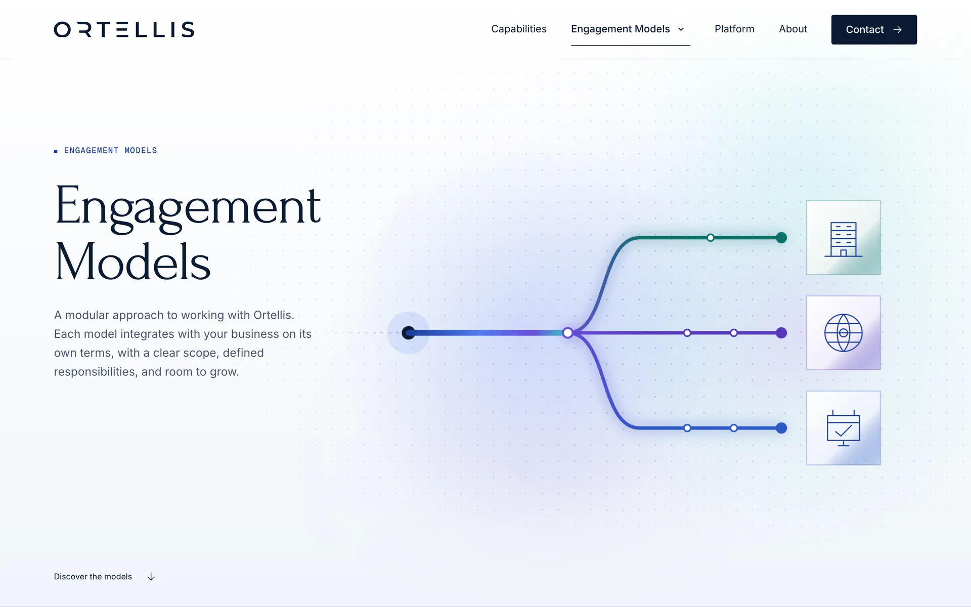
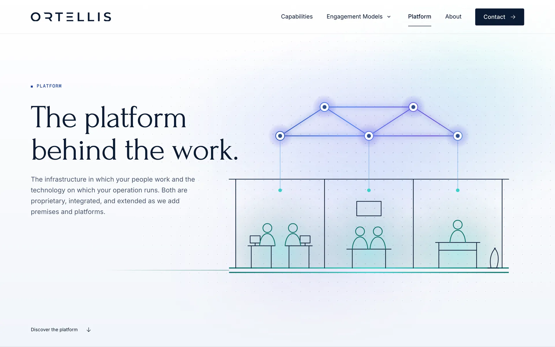
We built the identity around a horizon sign.
Identity
The wordmark uses spaced capitals with open, geometric letterforms. Above it, an open ring and a solid half-disc meet a thin horizon line. The single-color lockup provides the basis for light, dark, and photographic applications.


We used diagrams to explain the different offers.
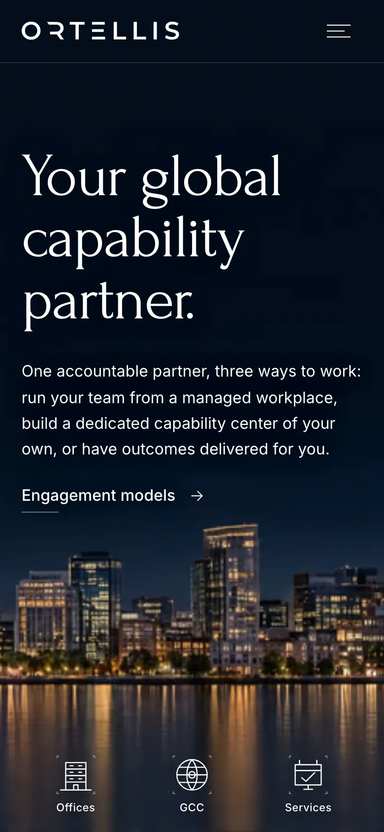
On phones, the offer stays ahead of the illustration.
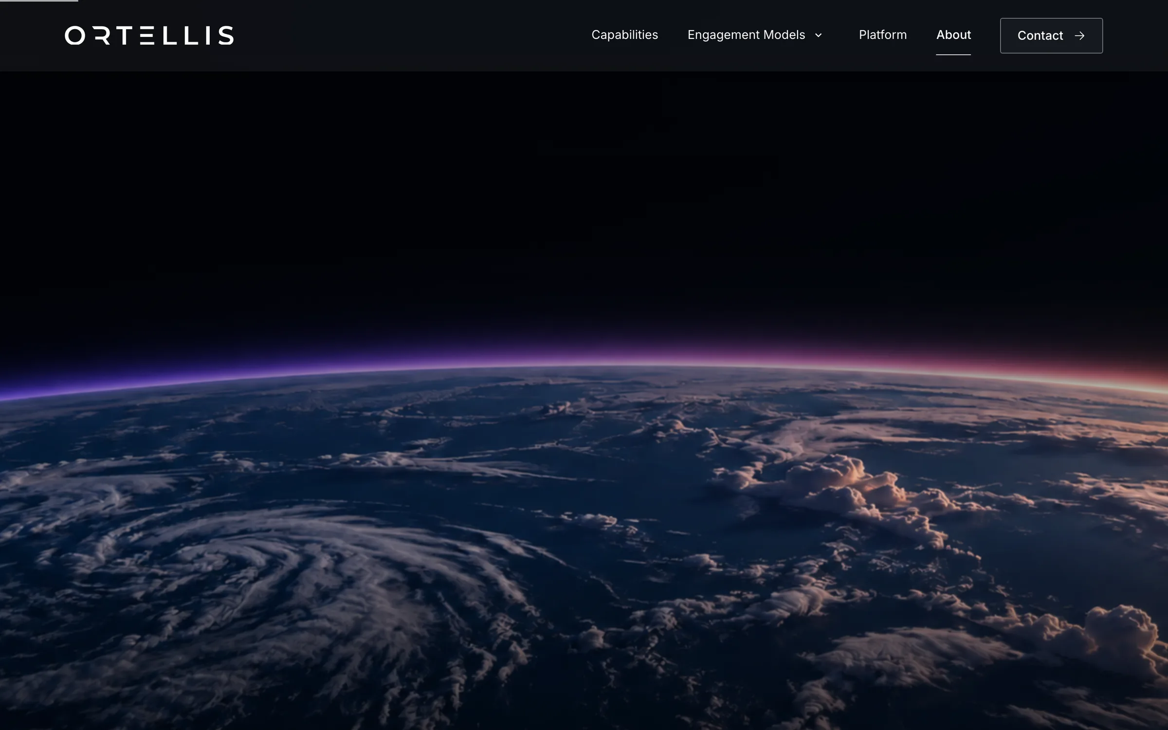
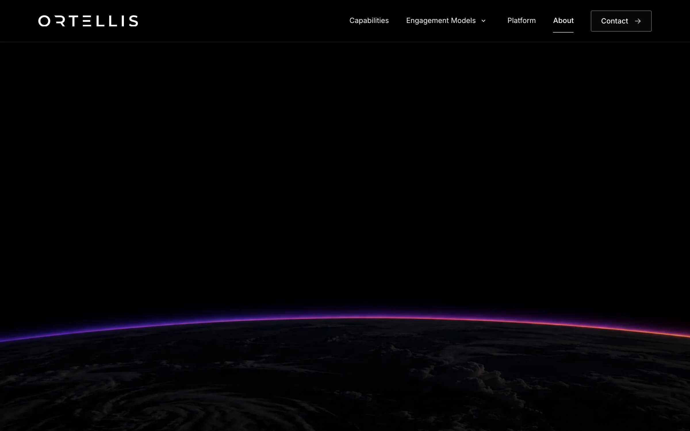
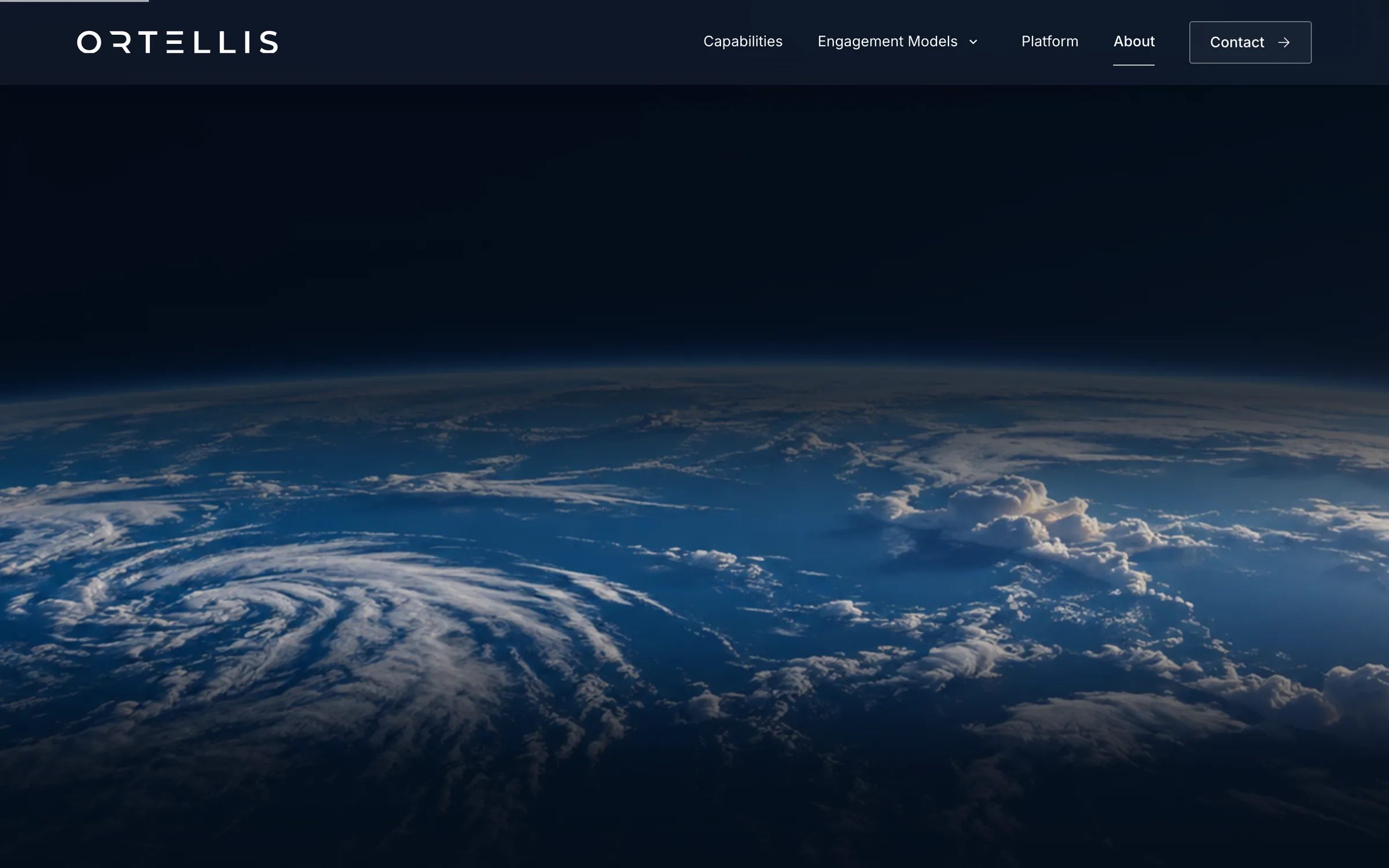
We carried the horizon into the site’s motion.
Motion
The home film changes the light over the waterfront. On About, scrolling moves the Earth from night through dawn to daylight. Both treatments extend the horizon sign into the page rather than introducing a separate visual motif.
Credits
Team
- reDesign Identity, website design
- reLabs Website build and release
Built with
- Astro
- Cloudflare Workers and R2
- Claude
Next project: Humanely
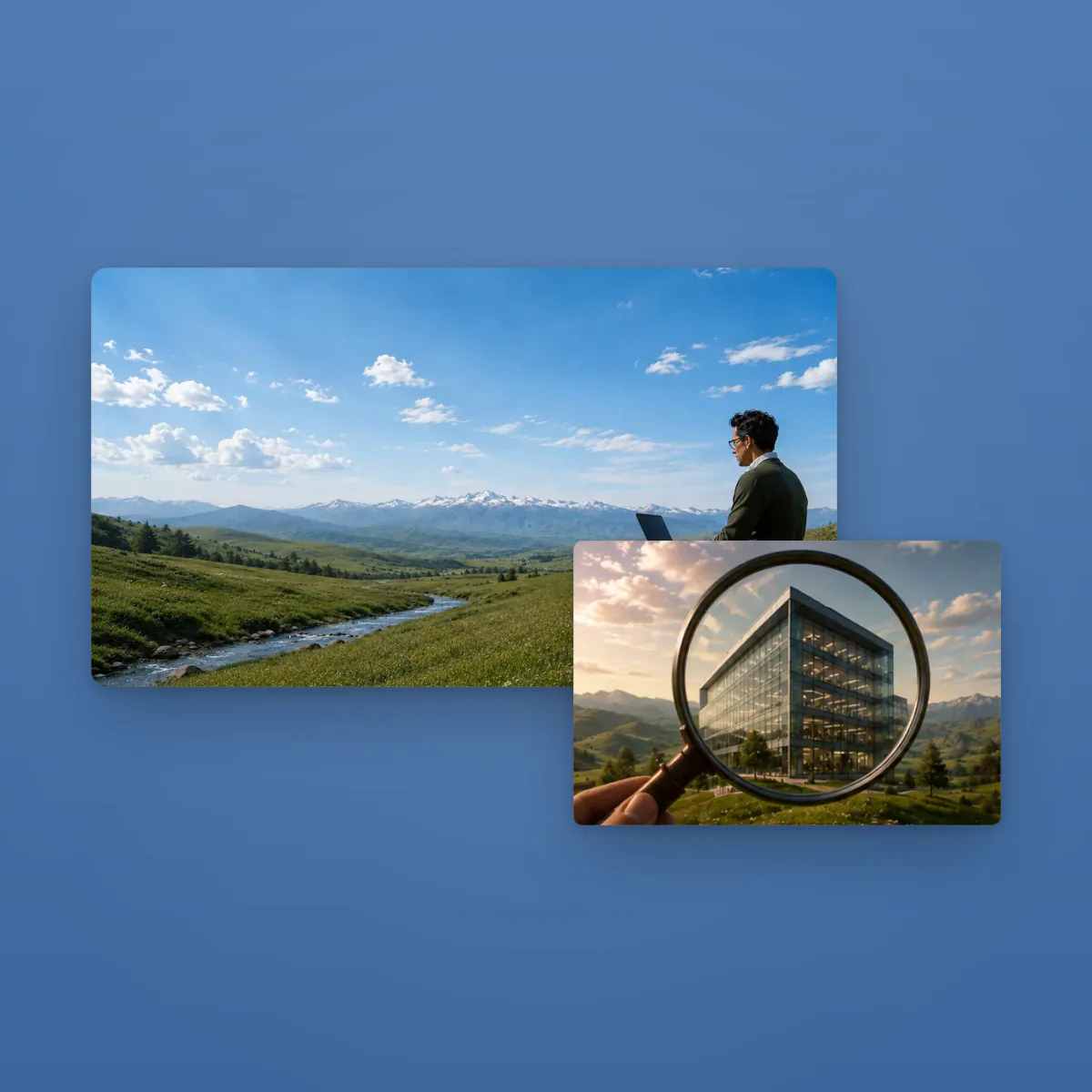 Humanely. A website introducing Humanely’s apps through a shared visual language