Vulkro. We designed and built Vulkro's security website.
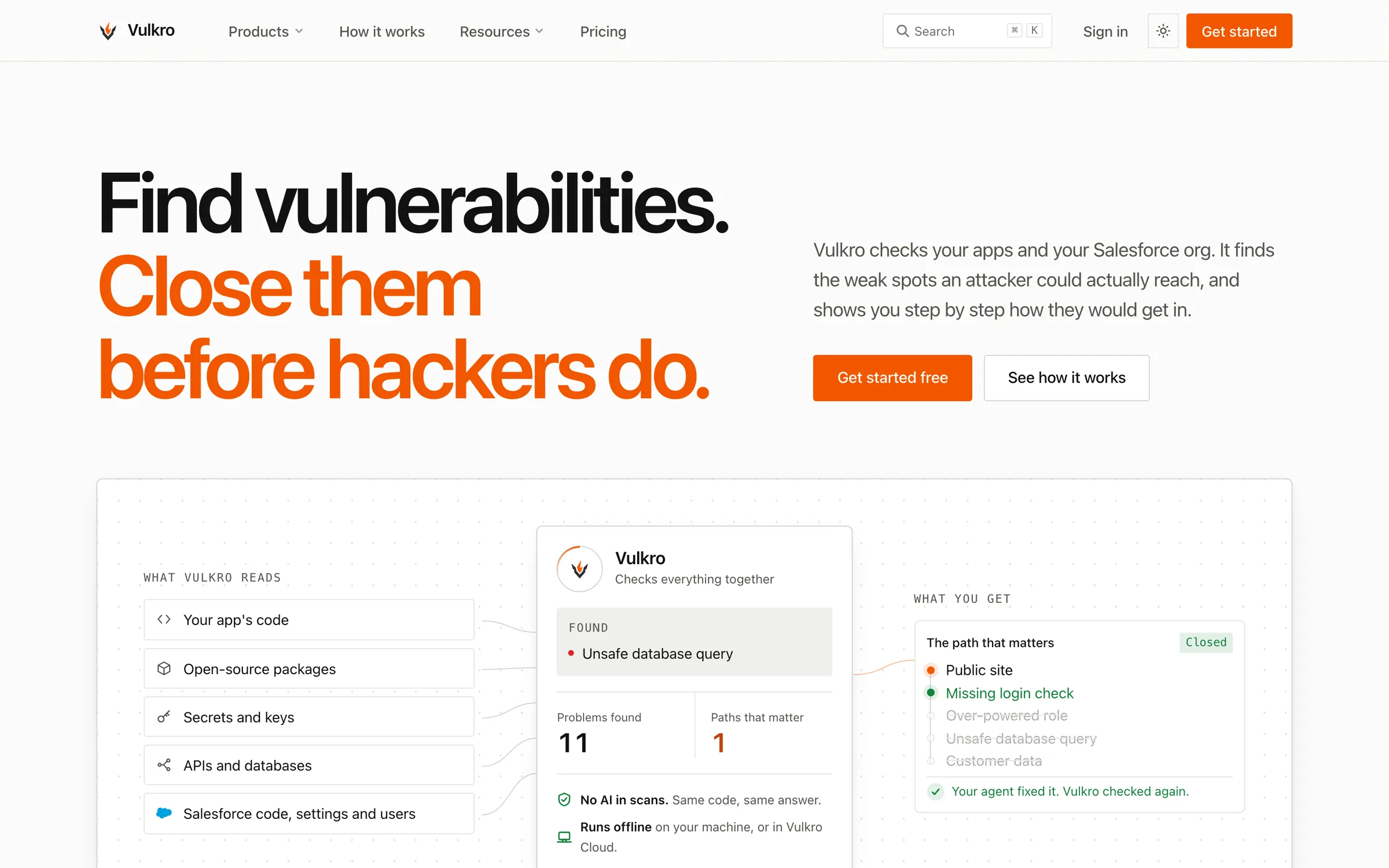
The challenge
Vulkro's website has to explain a security finding to the engineer evaluating it and the lead reviewing the purchase. The design task was to connect the product claim to an understandable attack path, then make the supporting evidence and its limits visible.
We designed the page hierarchy, attack-path figures, paper and night themes, and shared interface components. The Salesforce page develops a specific example, while Proof and Pricing answer separate evaluation questions. That separation lets visitors move from the claim to a specific example, then inspect the evaluation and offer.
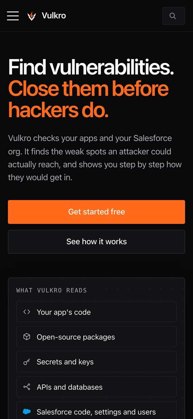
- Designed themes
- 2
- The preserved captures show paper and night versions of the site.
- Page types in the captured set
- 5
- Home, Salesforce, Cloud, Proof, and Pricing.
- Accent linking path and action
- 1
- Orange emphasizes the illustrated route and primary controls.
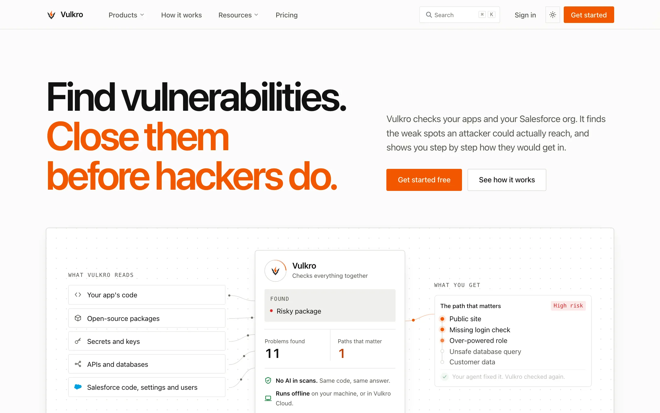
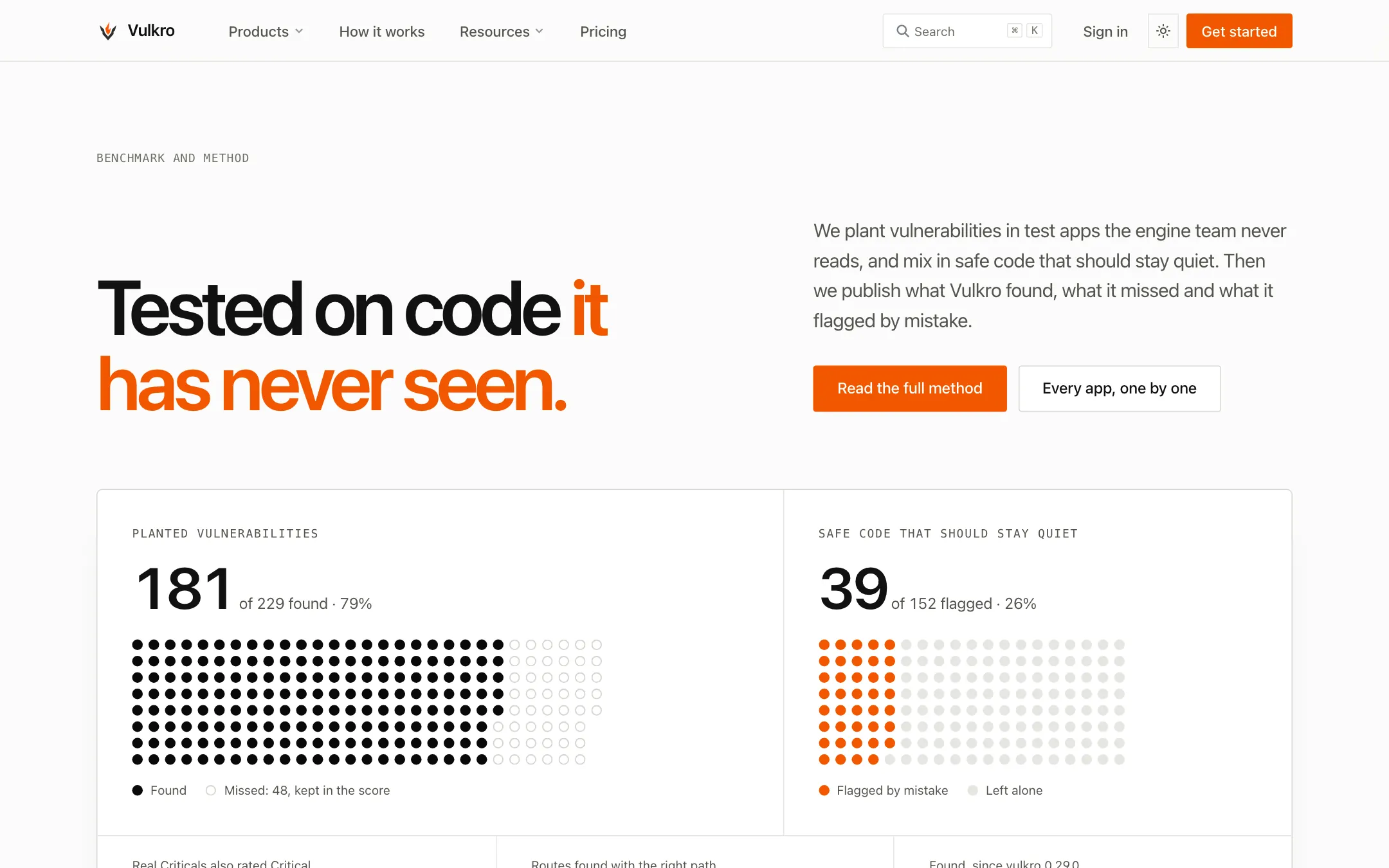
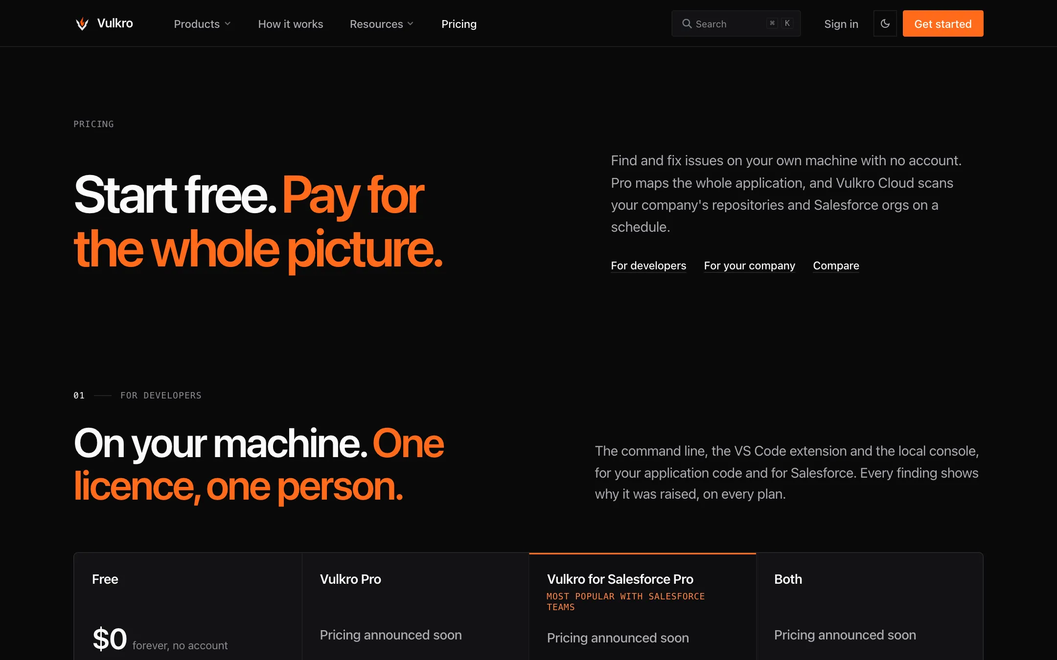
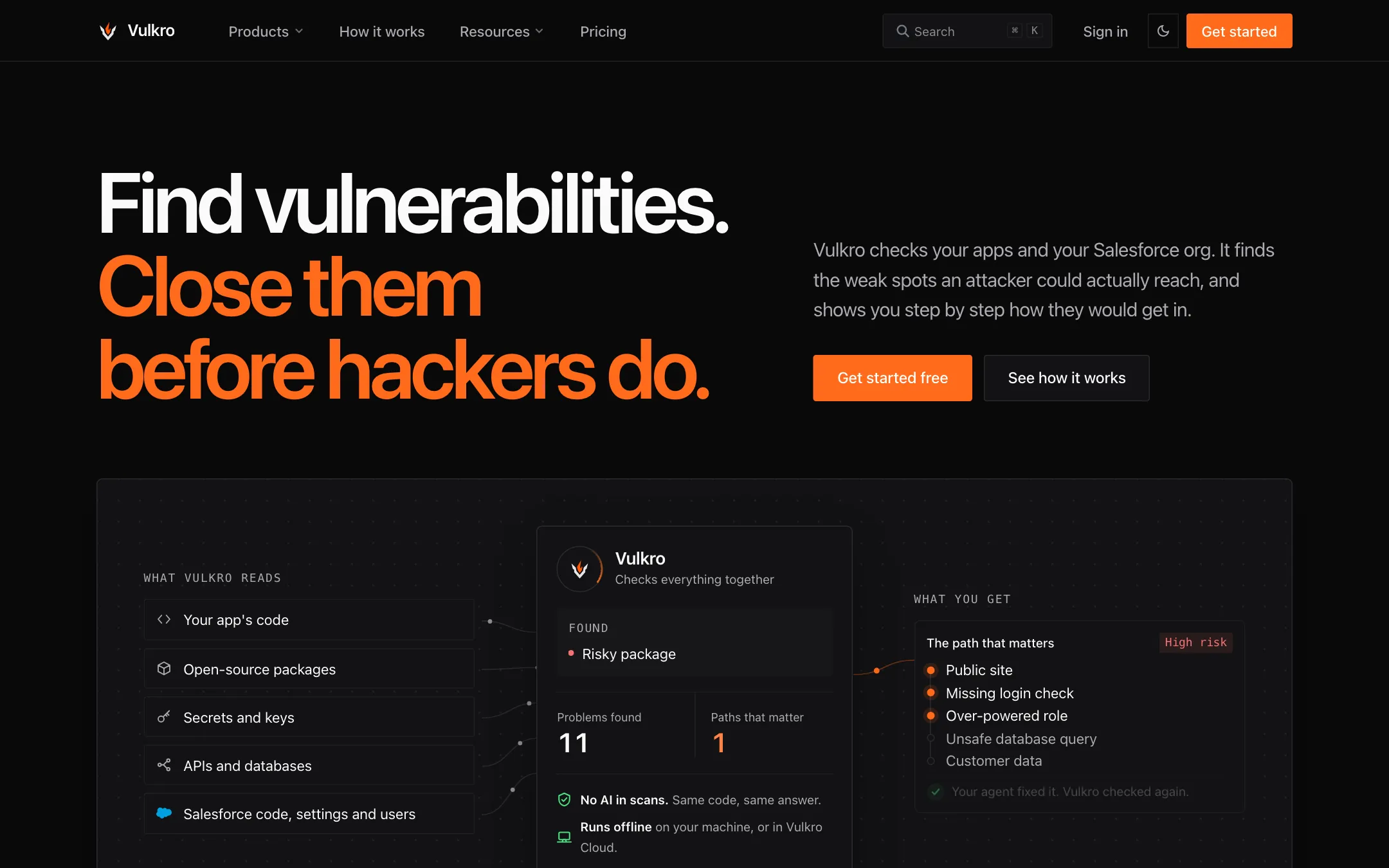
Paper, ink, and orange give the attack path a clear hierarchy.
Design direction
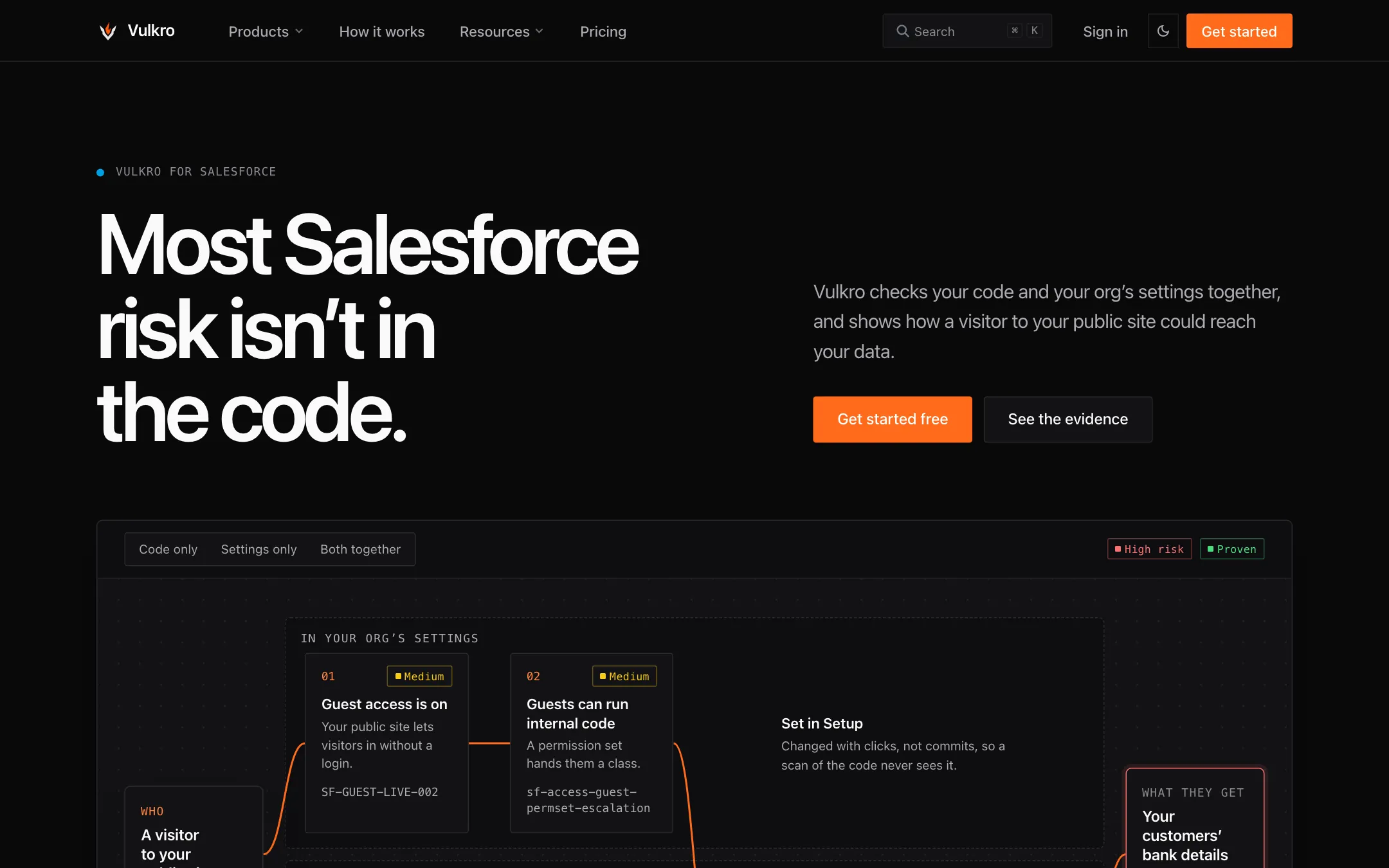
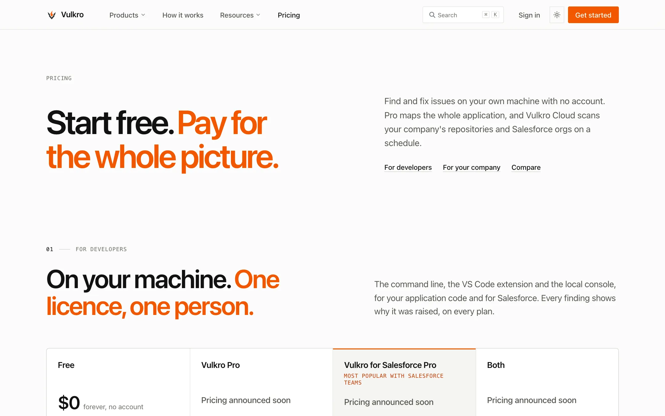
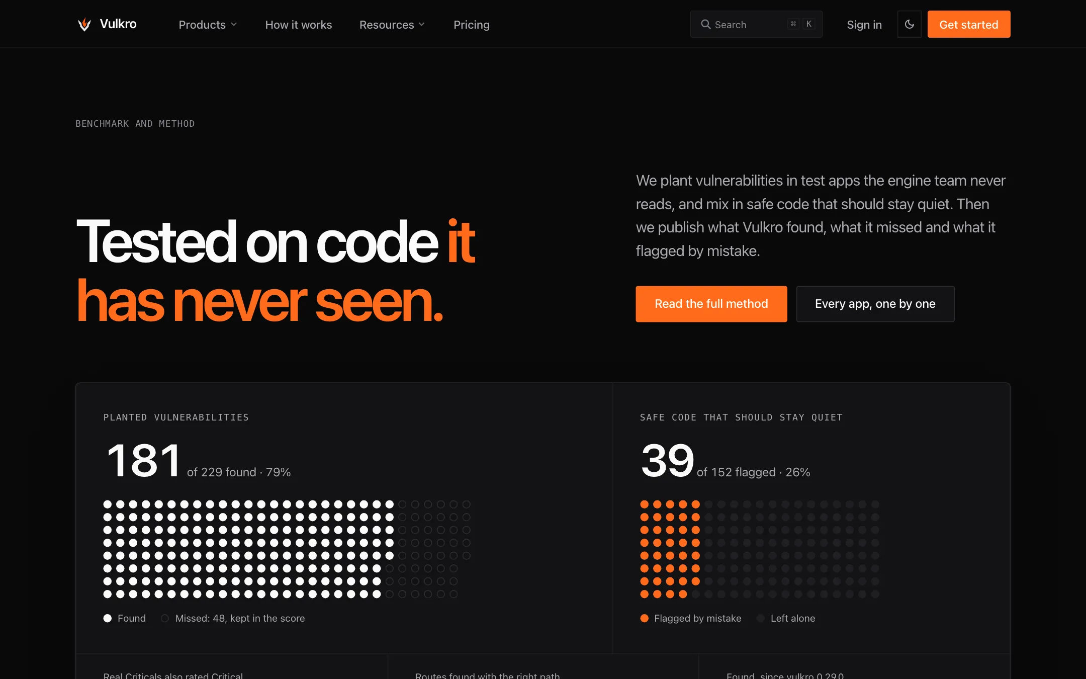
The captured direction uses light paper, dark ink, and fine lines to separate the explanation from its background. Orange emphasizes the attack path and primary actions. The night theme changes the surface roles while retaining the same content hierarchy. Fine lines group the details without competing with the path figure.
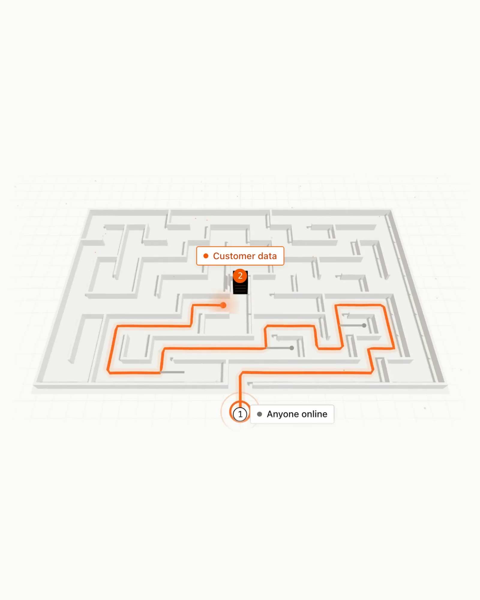
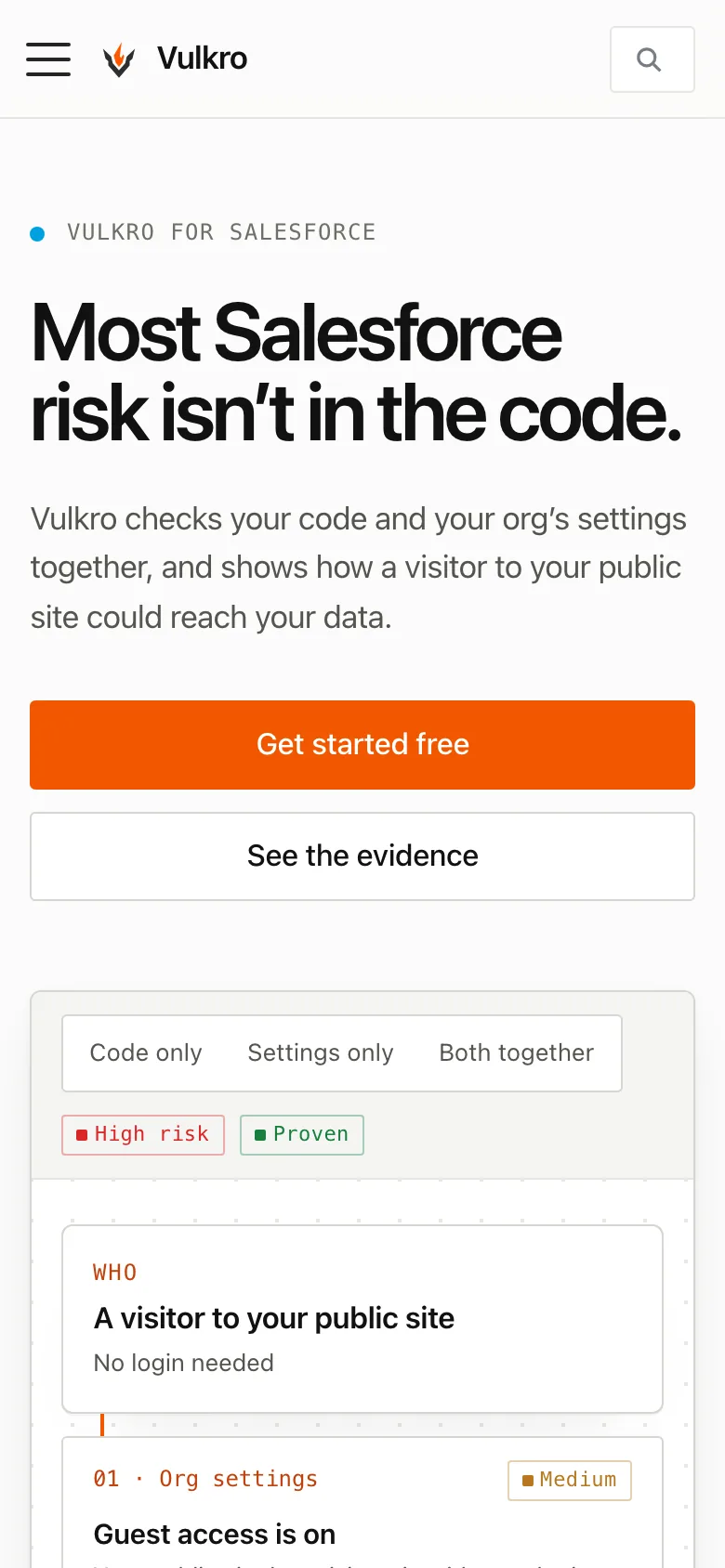
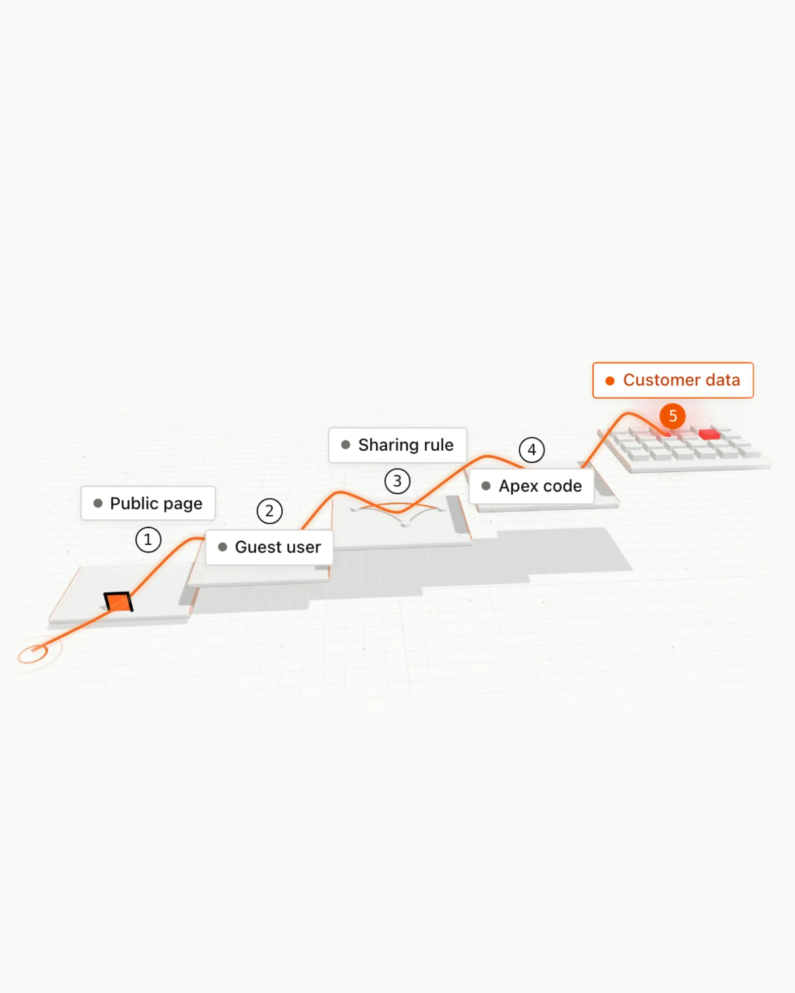
The Salesforce page explains the path across settings and code.
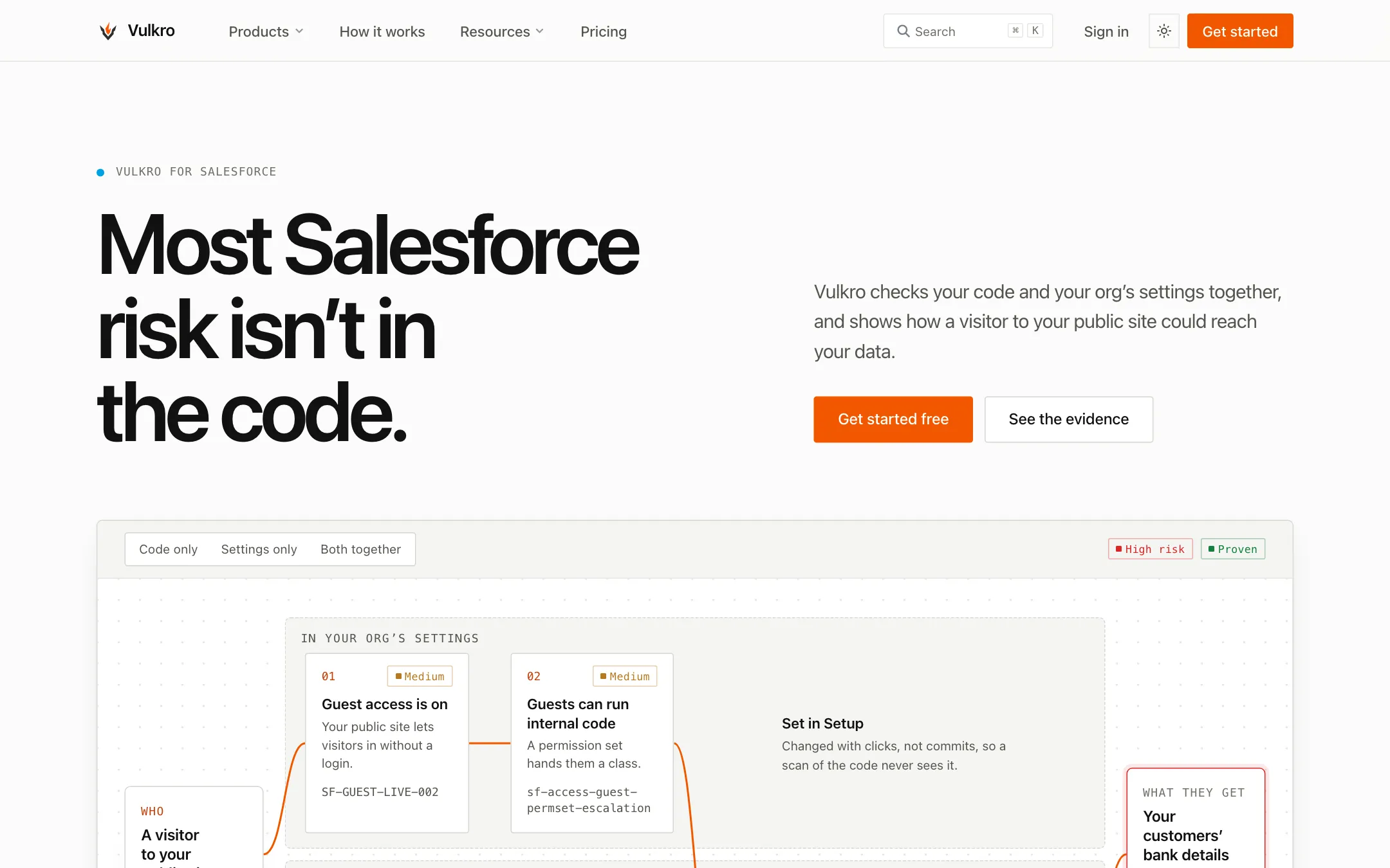
Both themes preserve the same page hierarchy.
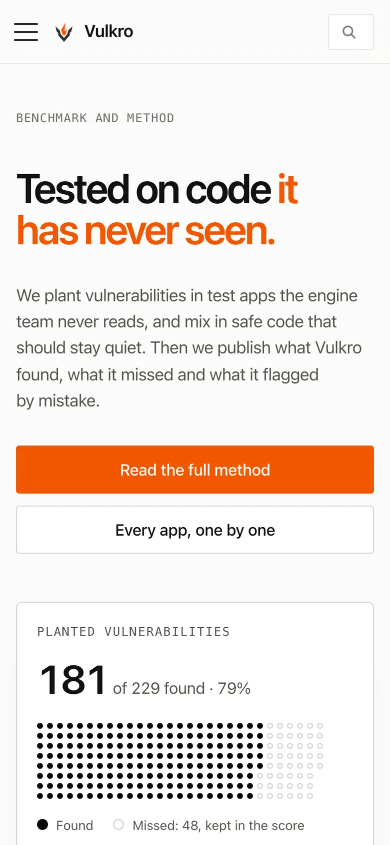
Proof and pricing give evaluation details their own pages.
Credits
Team
- reDesign Website design, brand application, and UI implementation
- reLabs Engineering
Built with
- Docusaurus and React
- Our own two-tier token system
- Claude and Claude Code
Next project: Reveriext
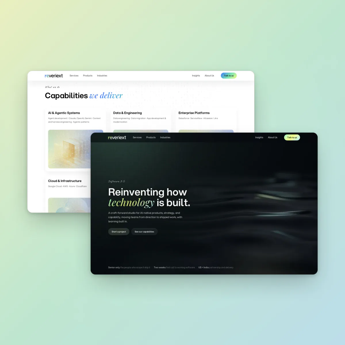 Reveriext. A company website connecting Reveriext’s services, products, and practices