Reveriext. We designed Reveriext’s company website.
The challenge
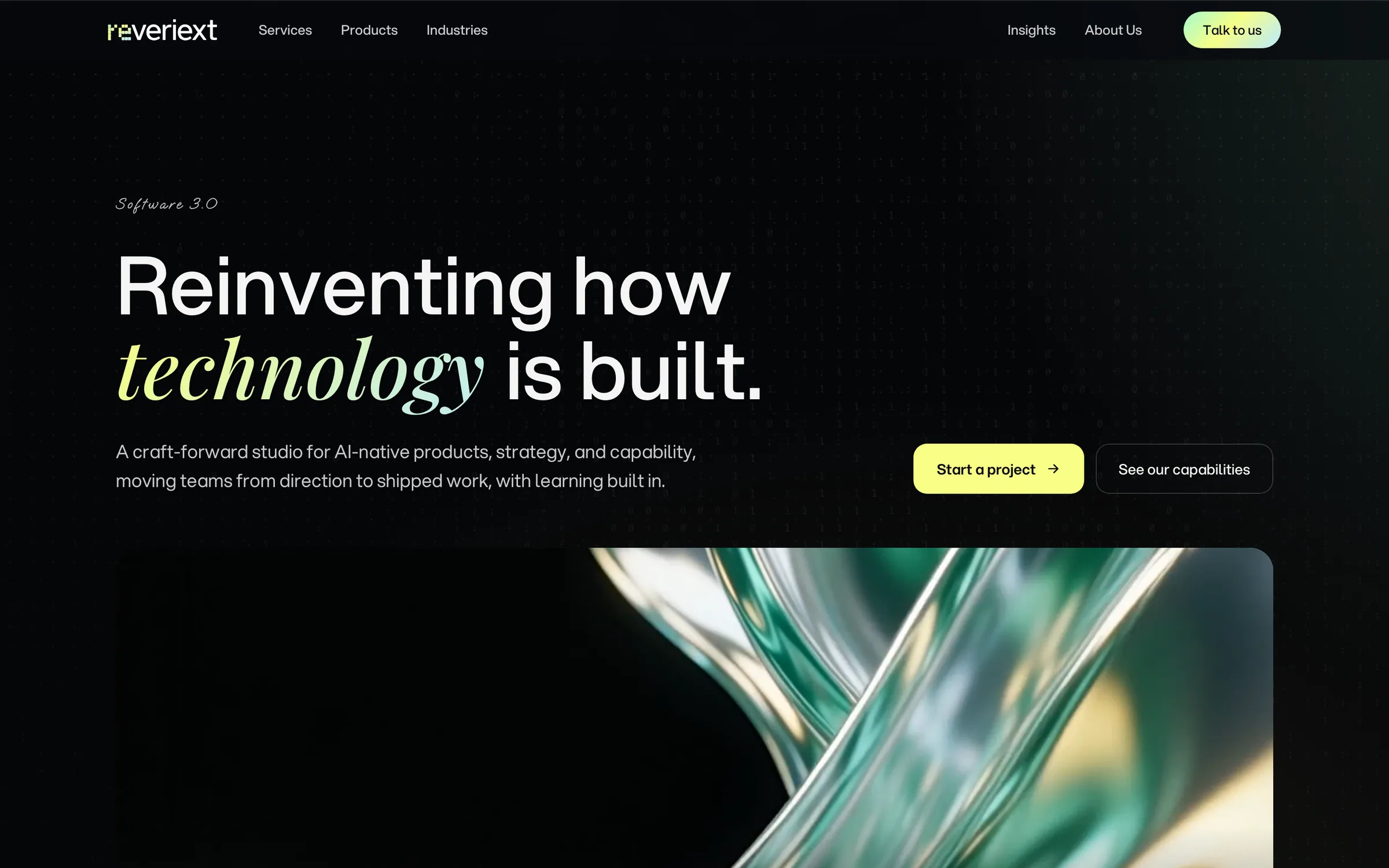
Reveriext brings services, products, and specialist practices into one company. The website needed to help a visitor understand that offer, find the relevant team, and examine its work before starting a conversation.
Our design work connected the home page to more detailed service and practice pages. A shared type hierarchy, card language, and navigation give those pages a common structure, while practice colors distinguish the teams within it.
- Page views
- 9
- Home, service, product, and practice views in the overview below
- Main grounds
- 2
- Black and white sections anchor the visual system
- Phone layouts
- 4
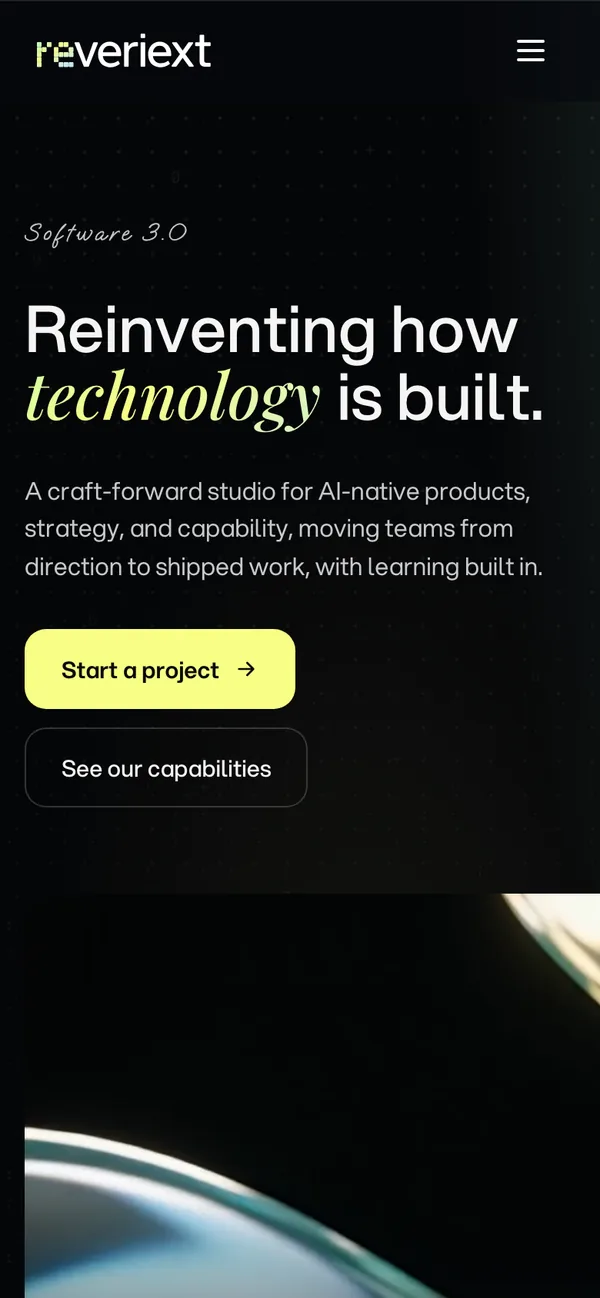
- Home, services, reLabs, and products shown at phone width
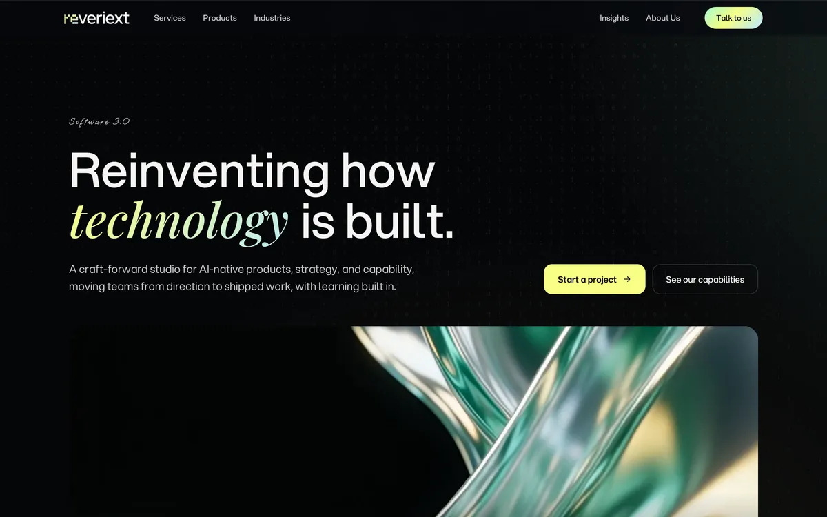
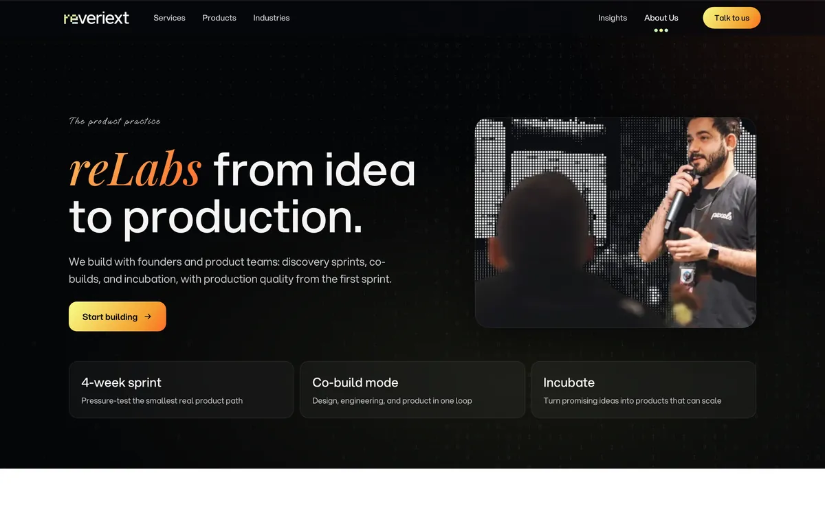
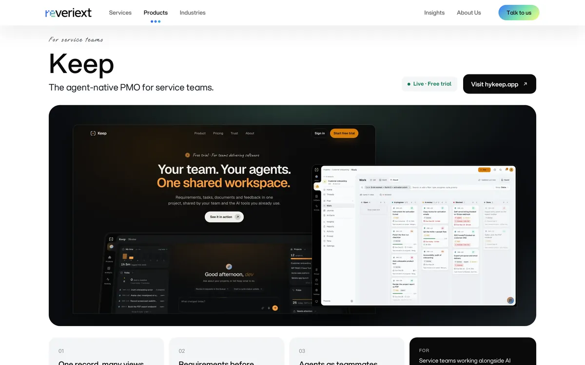
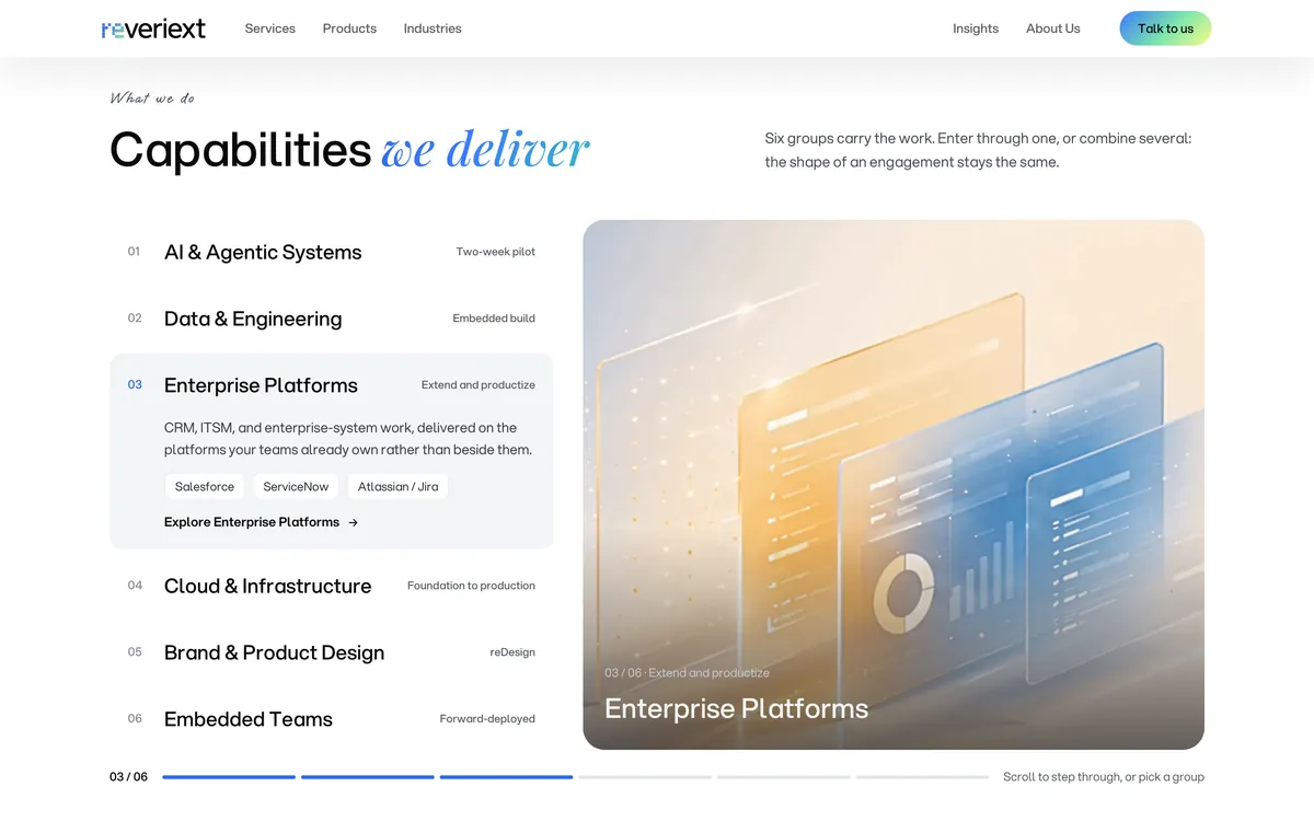
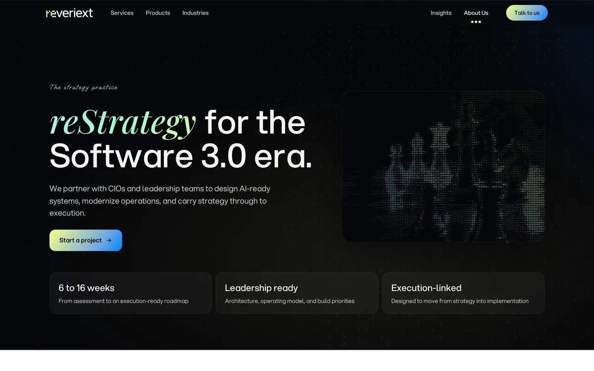
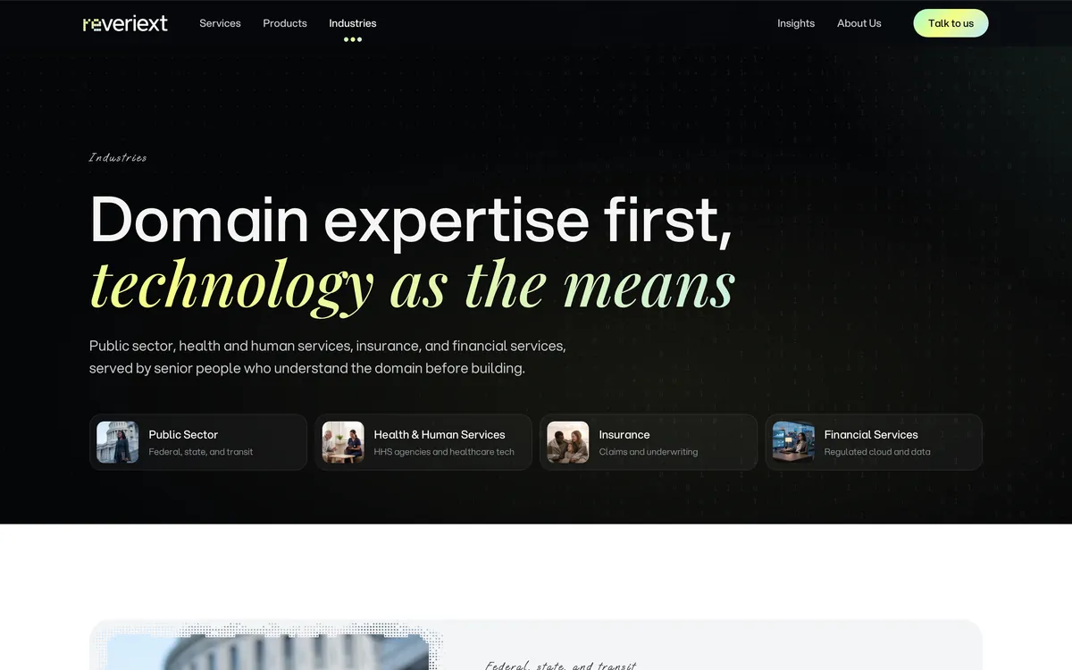
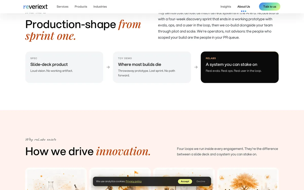
Black and white pages, with a color for each practice
Design direction
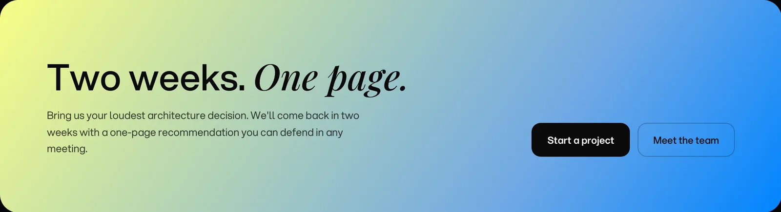
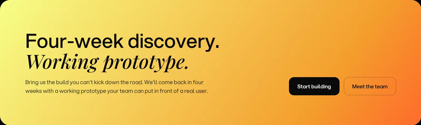
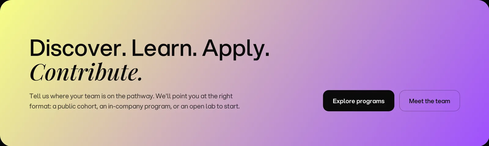
Black and white sections establish the reading rhythm. The header adapts to the section beneath it so navigation remains visible across that transition. Aspekta carries headings and body copy; Playfair italic gives a selected phrase a second voice. Practice gradients appear in highlights and closing bands, leaving the main content on a neutral ground.
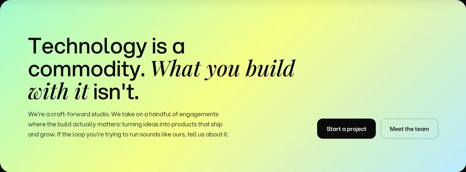
Adapt the hierarchy for a phone
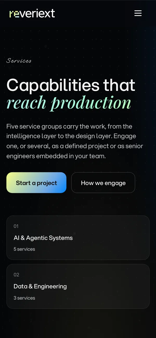
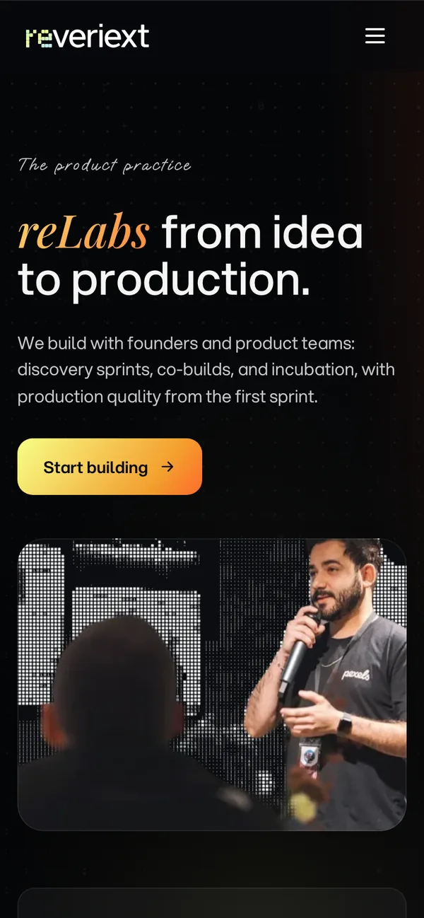
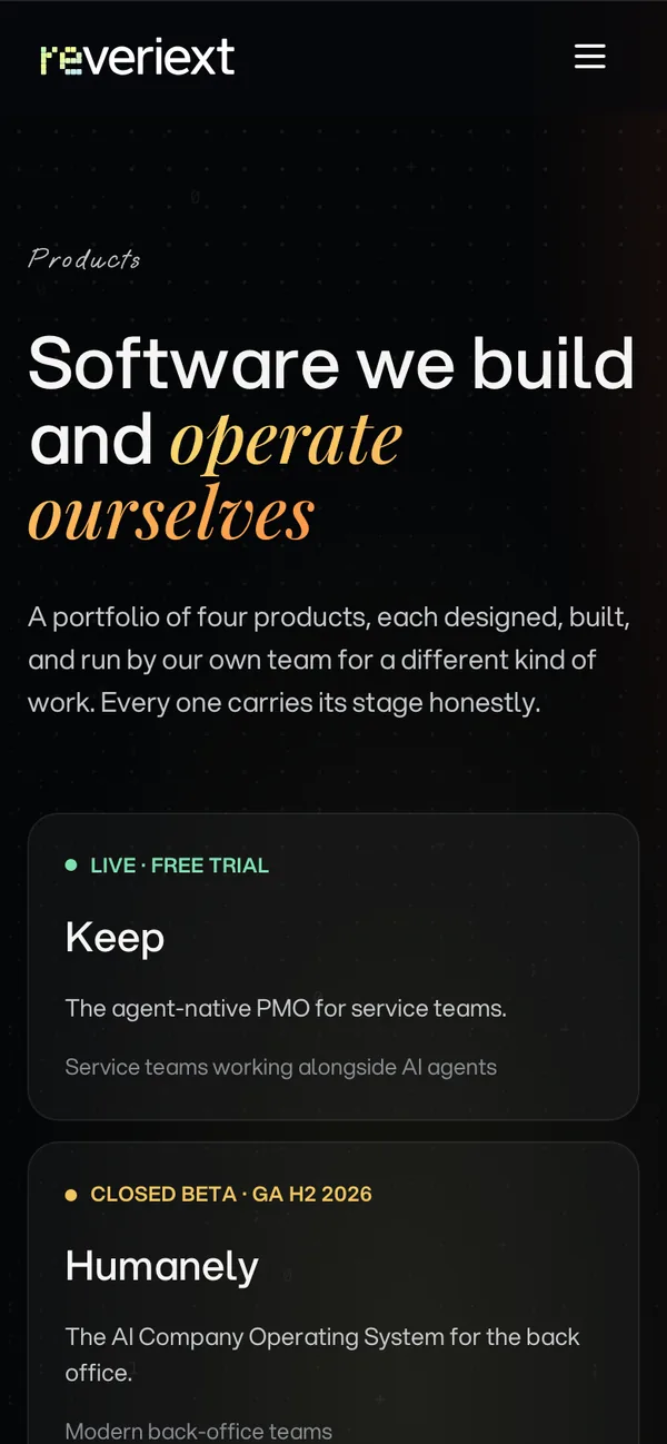
Carry the design into reusable page patterns
Design implementation
The implementation gives repeated elements the same behavior: a header that changes with its background, cards that become rails on smaller screens, and consistent type and action styles. In the capabilities section, a fixed presentation area pairs each service group with its film. Visitors can follow the scroll sequence or select a group directly.
From the Webflow home page to the v5 design

Credits
Team
- reDesign Brand system, website UX/UI, interface implementation
- reLabs Engineering
Next project: Company OS
 Company OS. Humanely’s company apps and member portal, connected by a shared interface system