Humanely. We designed Humanely's website and its visual language.
The challenge
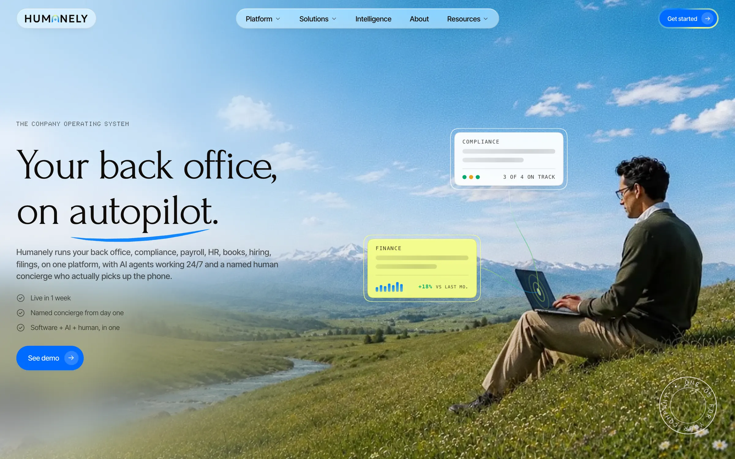
Humanely's website introduces a suite of company apps and a concierge service. Visitors need to understand the overall offer, explore an individual app, and distinguish the software from the people providing the service.
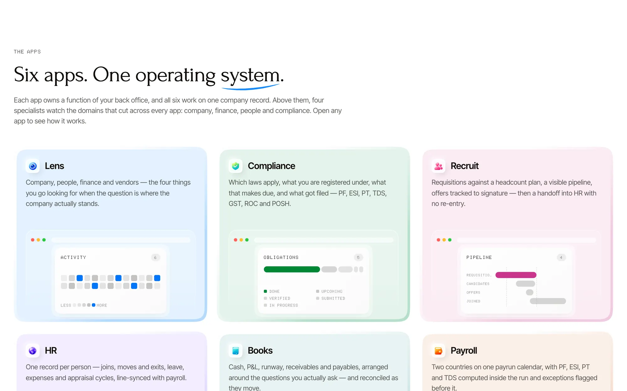
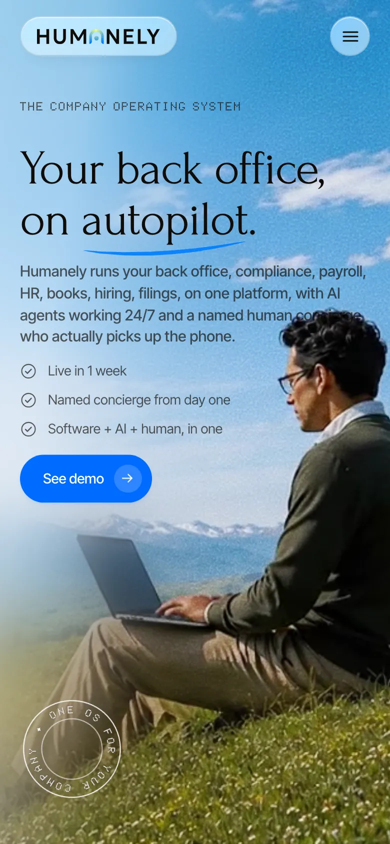
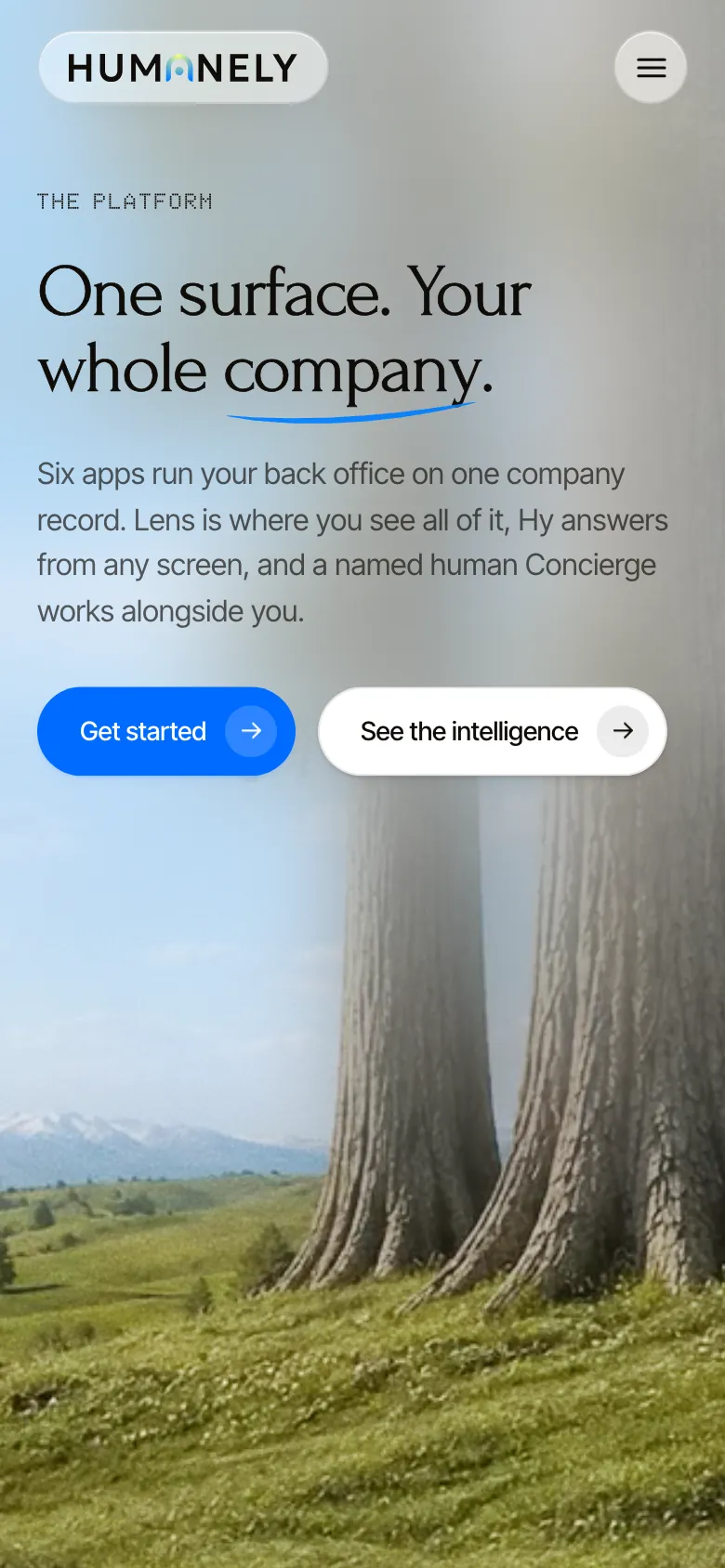
We designed the page hierarchy, app navigation, art direction, and responsive layouts. Outdoor photography connects the pages; product scenes explain relationships within the suite. A shared app-page structure gives each app the same place for its introduction and supporting detail.
- Main page examples shown
- 4
- Home, Platform, Intelligence, and About in the captured site.
- App pages in the shared structure
- 6
- Lens, Compliance, Recruit, HR, Books, and Payroll in the site's app-page list.
- Editorial sections
- 2
- Insights and Guides use layouts for published articles and reference content.
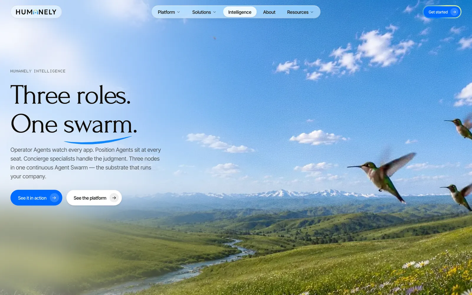
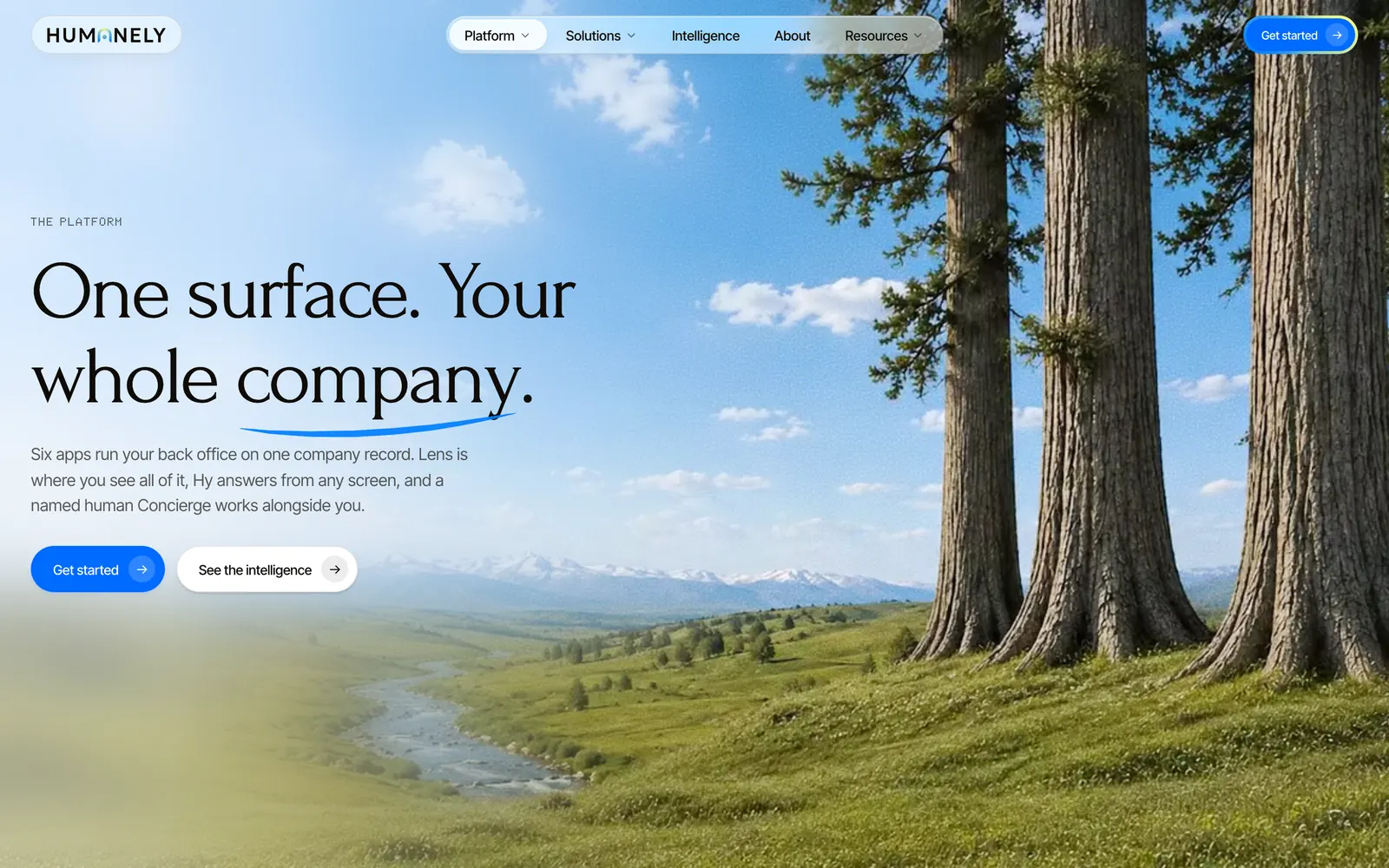
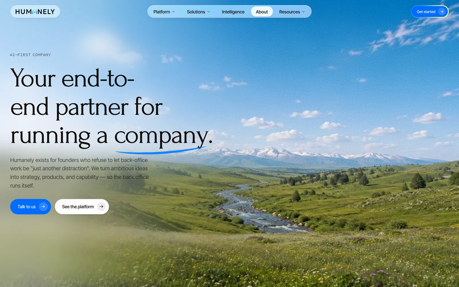
We used a shared scene language to explain the product.
Art direction
The scenes explain app relationships, records, and assistant actions without reproducing a full working screen. Raised cards and translucent panels give those explanations a common material. Neutral surfaces carry most of the composition; blue marks emphasis, app icons retain their colors, and lime highlights selected elements. Over photography, the panels reveal the landscape beneath them.
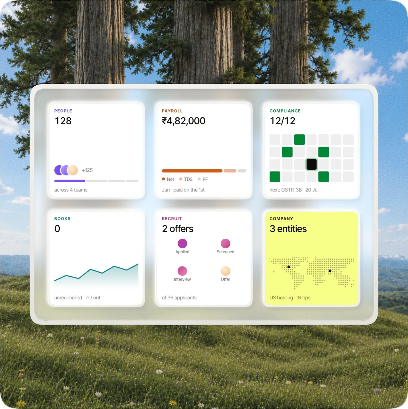
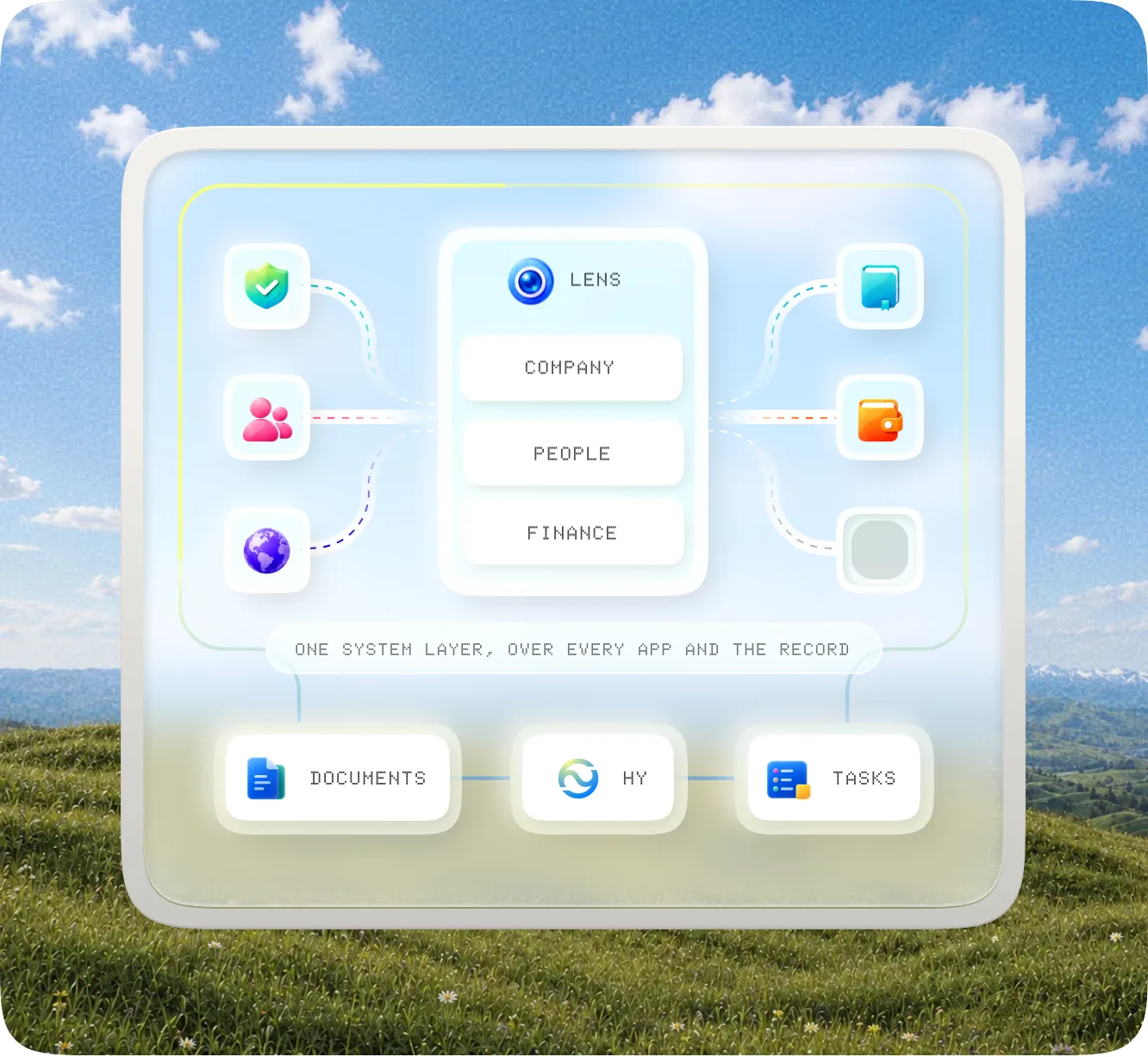
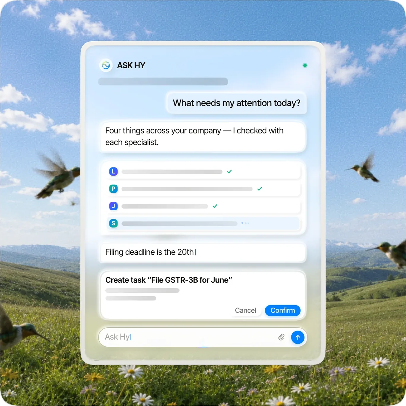
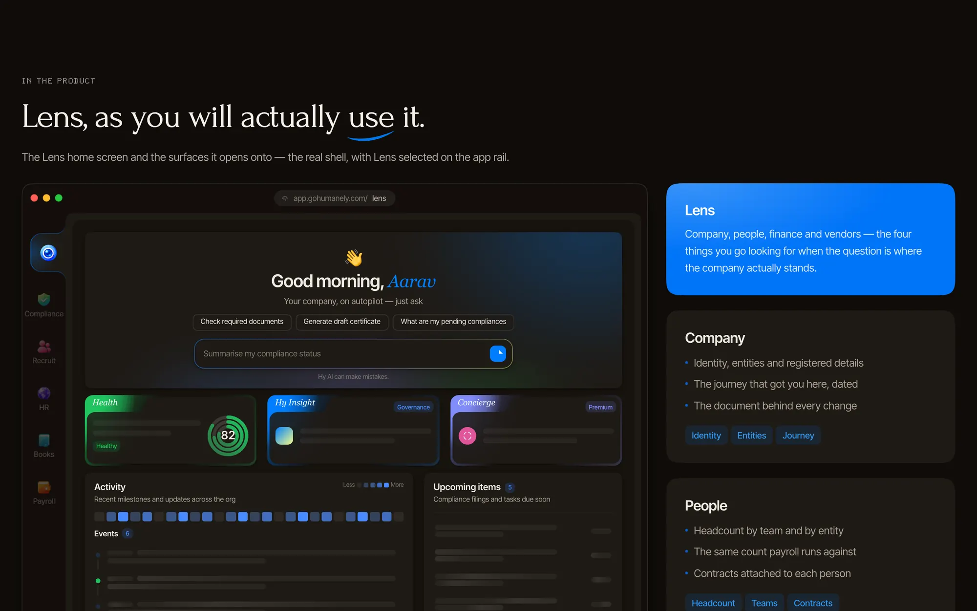
We gave the six app pages a consistent structure.
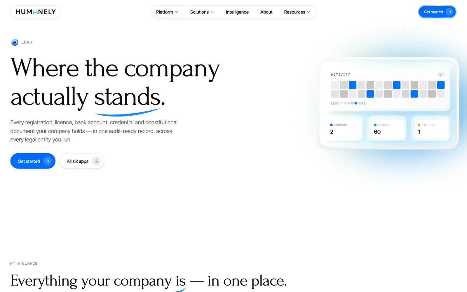
We adapted the relationship between headlines and scenes for phones.
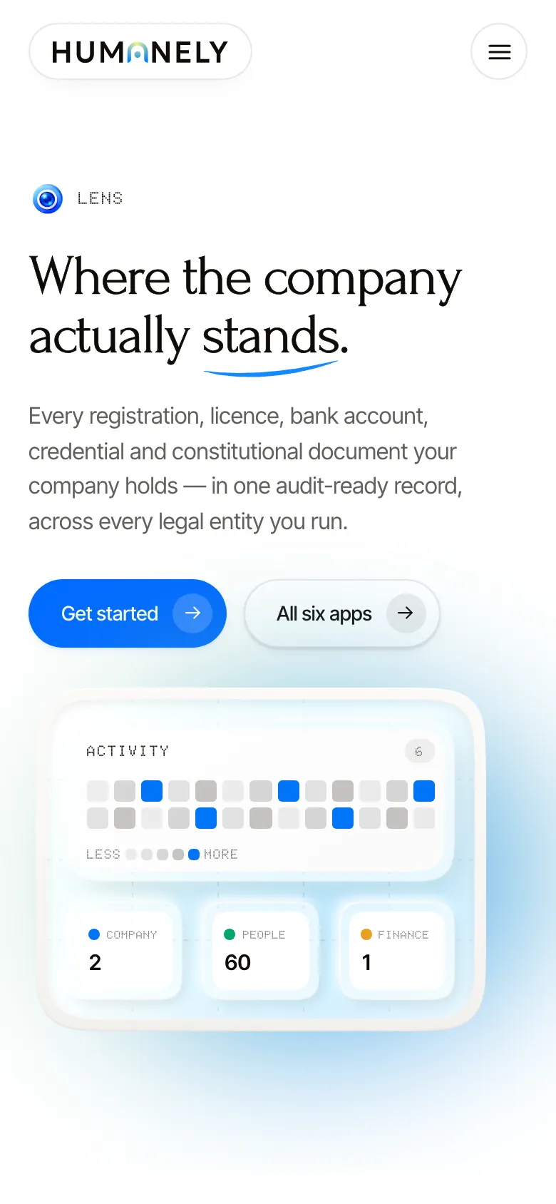
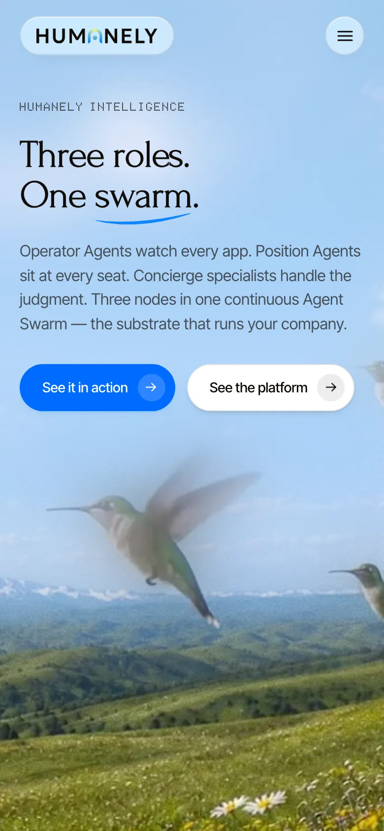
We used a product preview alongside the explanatory scenes.
Design implementation
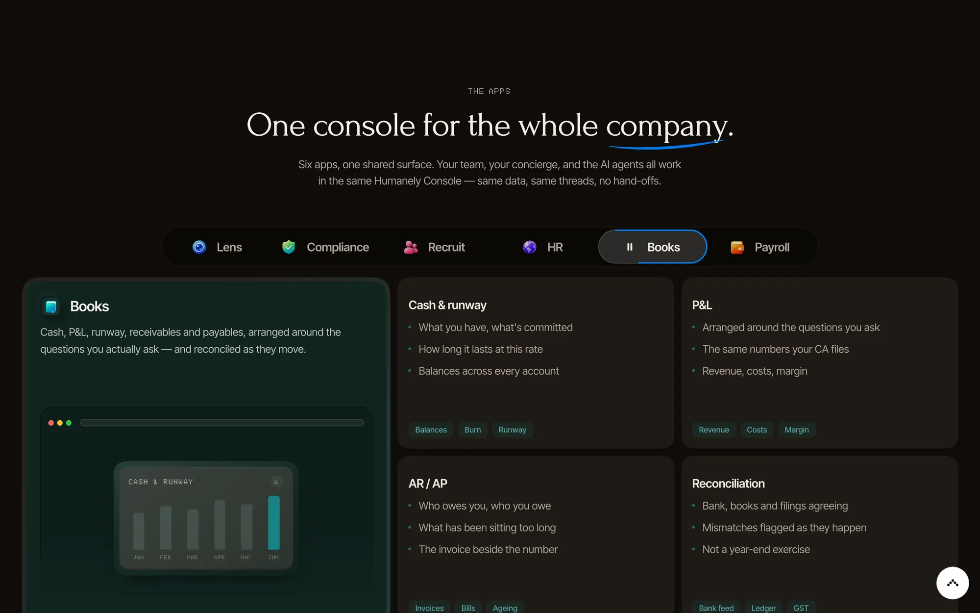
The home-page console presents a more detailed view of the software after the simpler product explanations. App tabs sit beside a shell containing summary figures, insight cards, and activity. The scene language introduces the relationships; the console shows the denser interface. Shared styles carry the website's type, color, and spacing decisions into the page layouts.
Credits
Team
- reDesign Website design, art direction, interface implementation
- reLabs Website engineering
Next project: Keep website
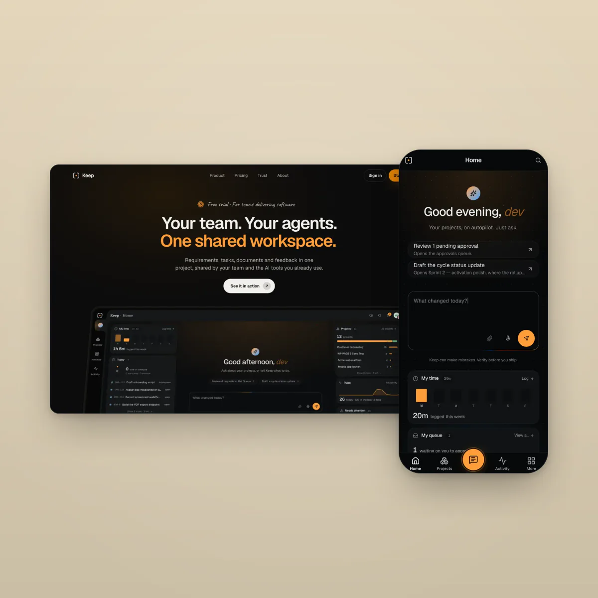 Keep website. A product website built around recorded demonstrations and a clear path to access