Keep. We designed and built Keep's website.
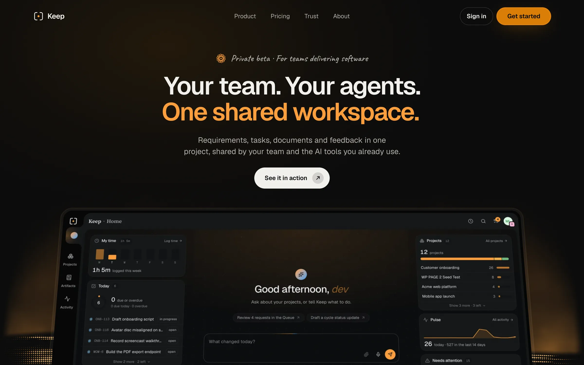
The challenge
Keep is a project workspace for teams and their AI agents. The website had to explain that shared way of working, show the interface, and make the path to access clear.
We compared five working directions with the same content. The final site combines a dark setting for product films with a clear headline hierarchy, then gives Product, Pricing, Trust, and Access their own pages. This study covers the website; the app has its own design story.
- Built routes in the recorded site snapshot
- 13
- Website verification, September 2026; includes utility routes.
- Product films in the capture inventory
- 9
- Website capture documentation; recorded with local demo data.
- Working design directions compared
- 5
- Archived prototypes; the selected system is documented separately.
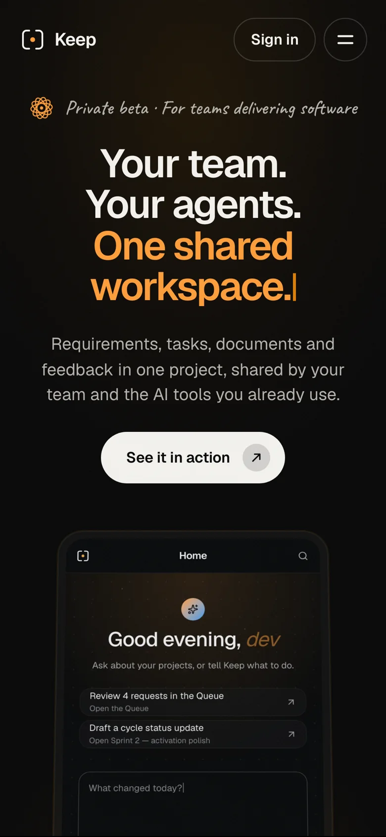
We paired large headlines with recorded product views.
Design direction
Keeping the content consistent made the five directions comparable. We chose record cards, dark surfaces, and scroll sequences from Cinematic Night, with large, tightly set headlines from Swiss System. The roles are distinct: the headline introduces the idea, and the product view supplies detail. Amber connects the website to the app.
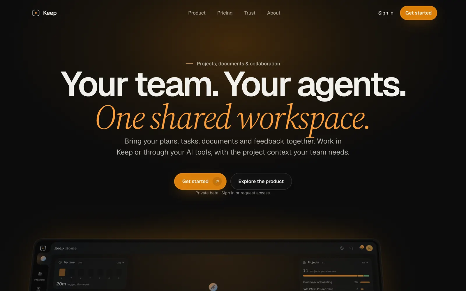
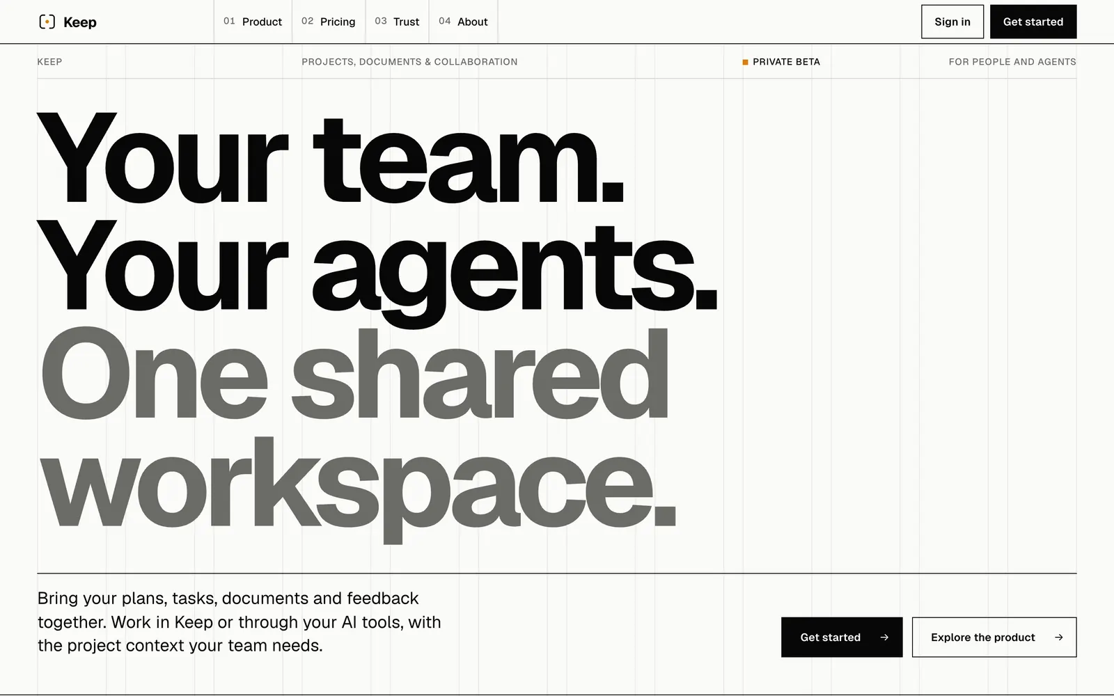
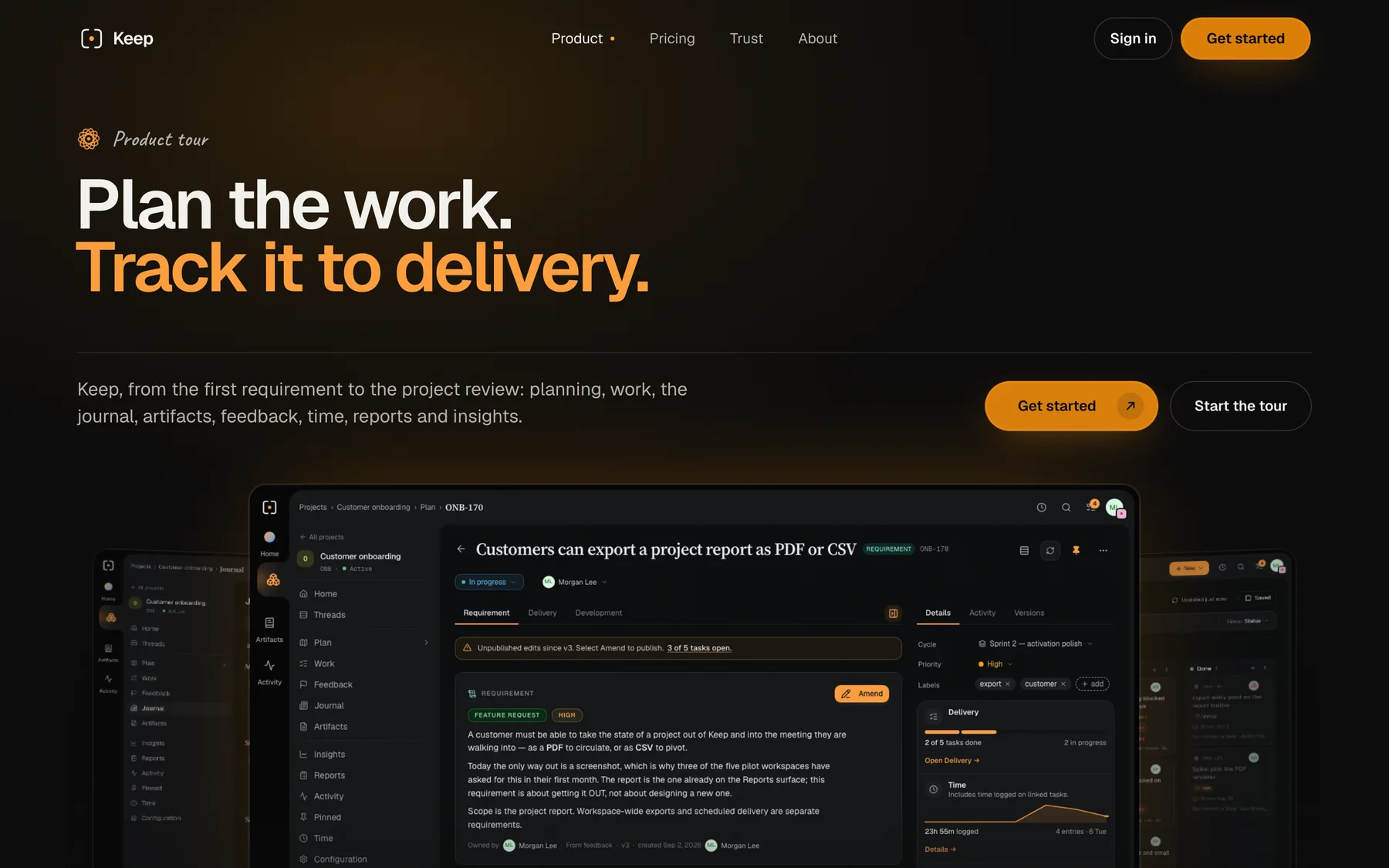
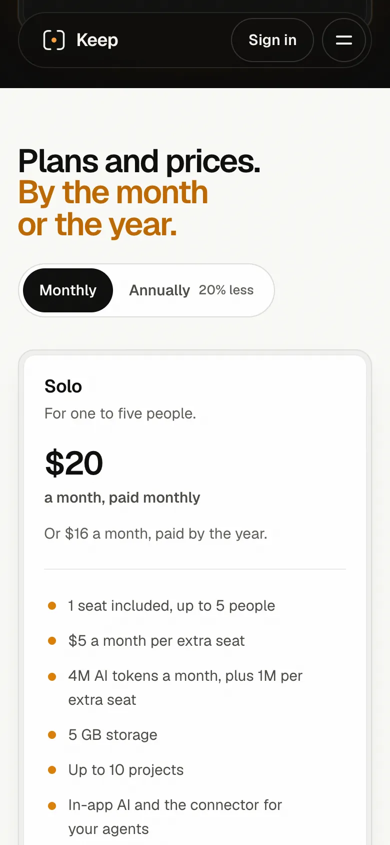
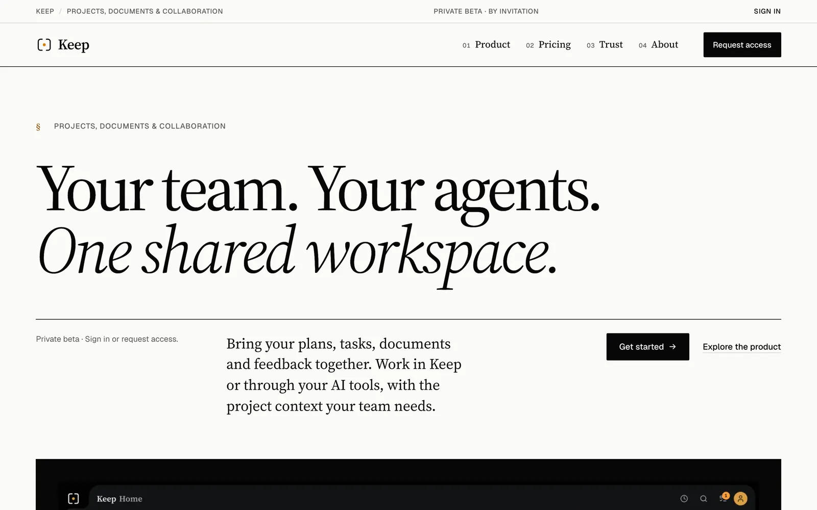
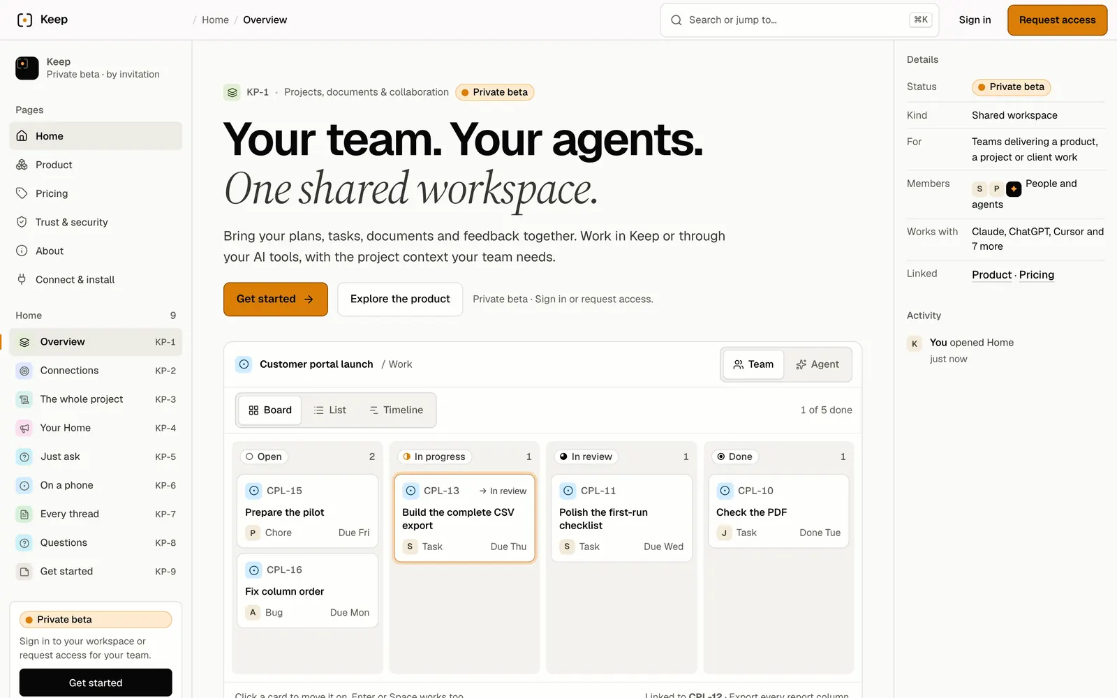
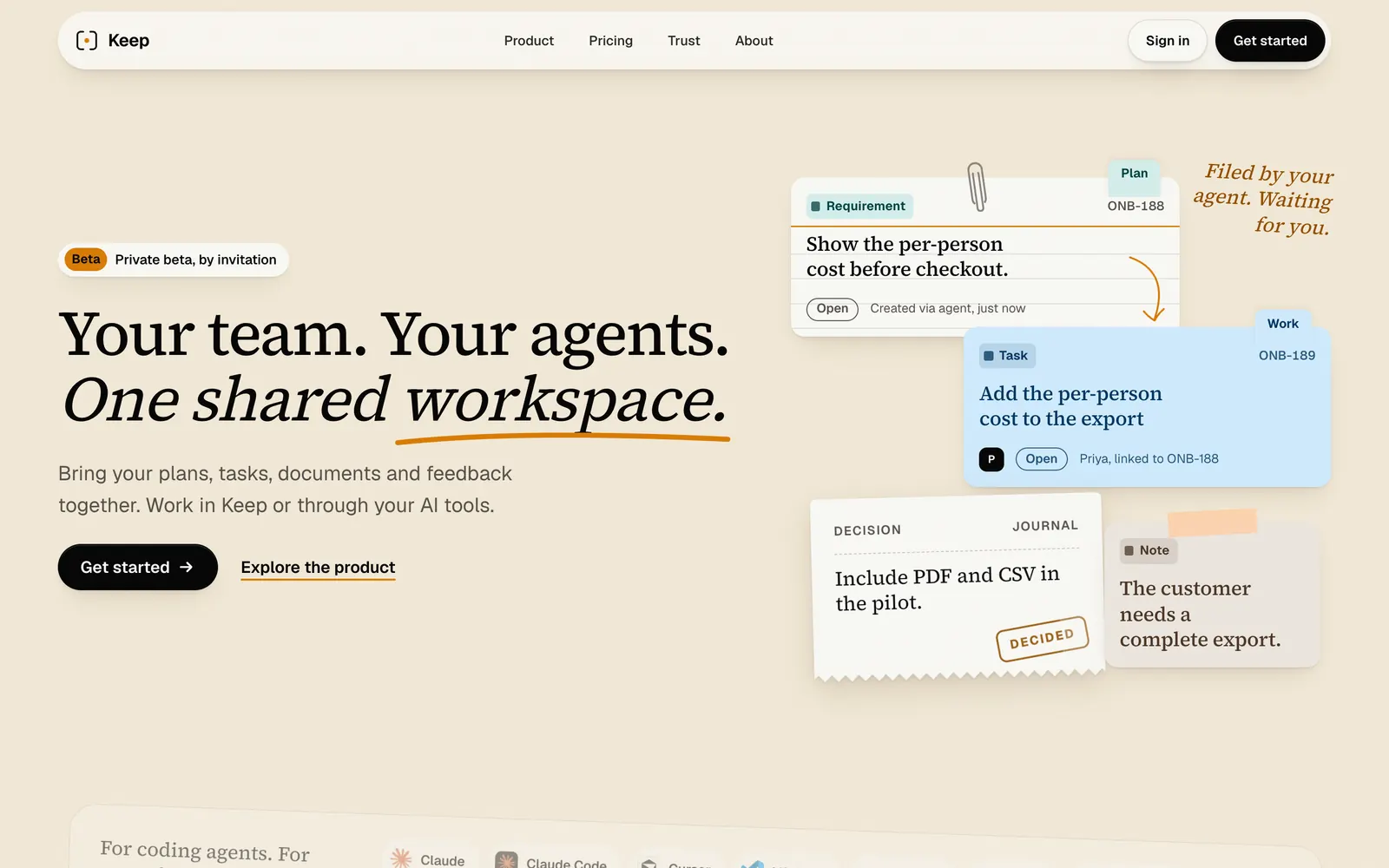
A shared opening connects the product, trust, and access pages.
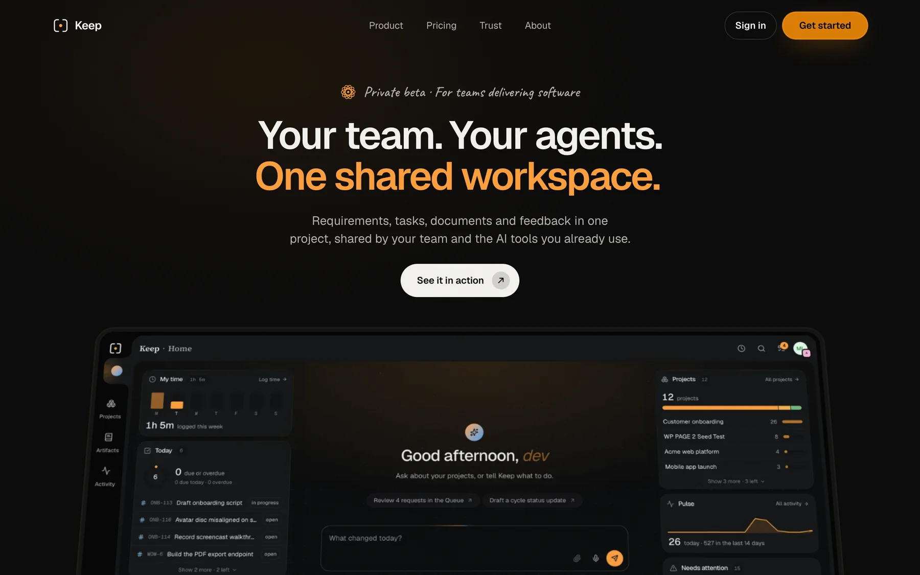
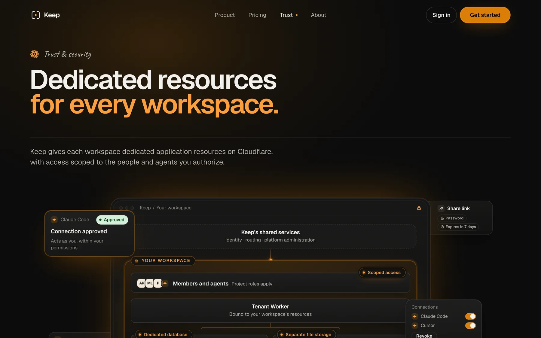

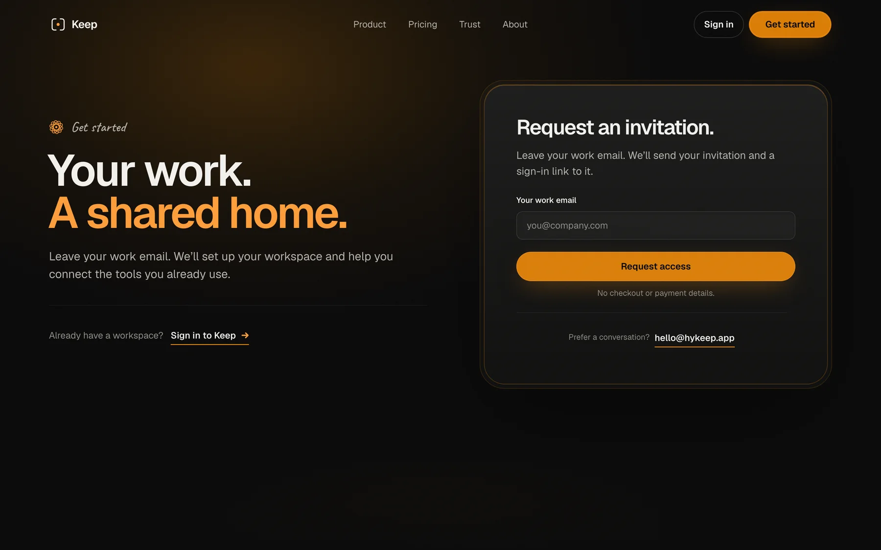
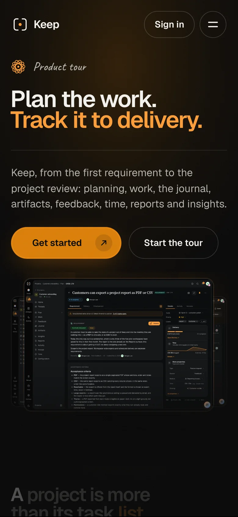
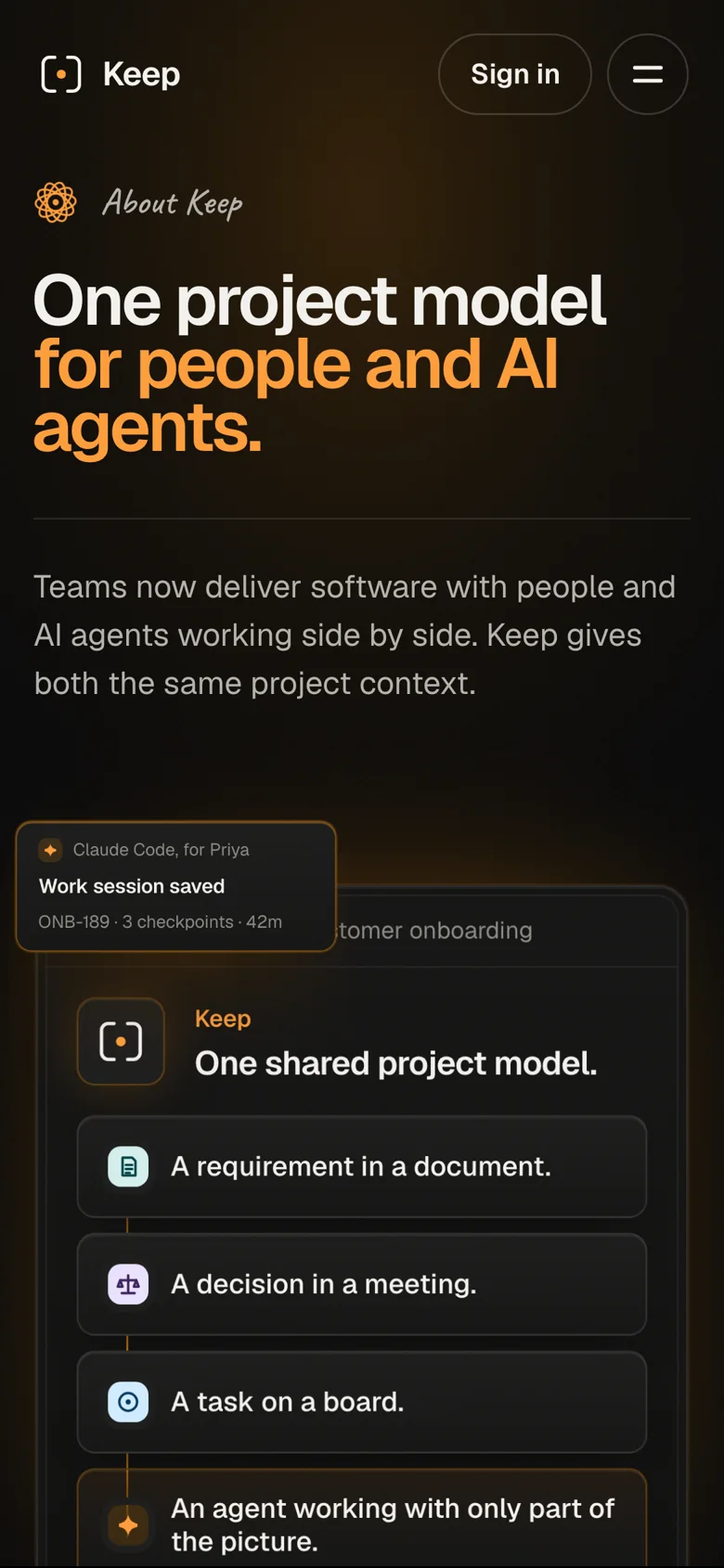
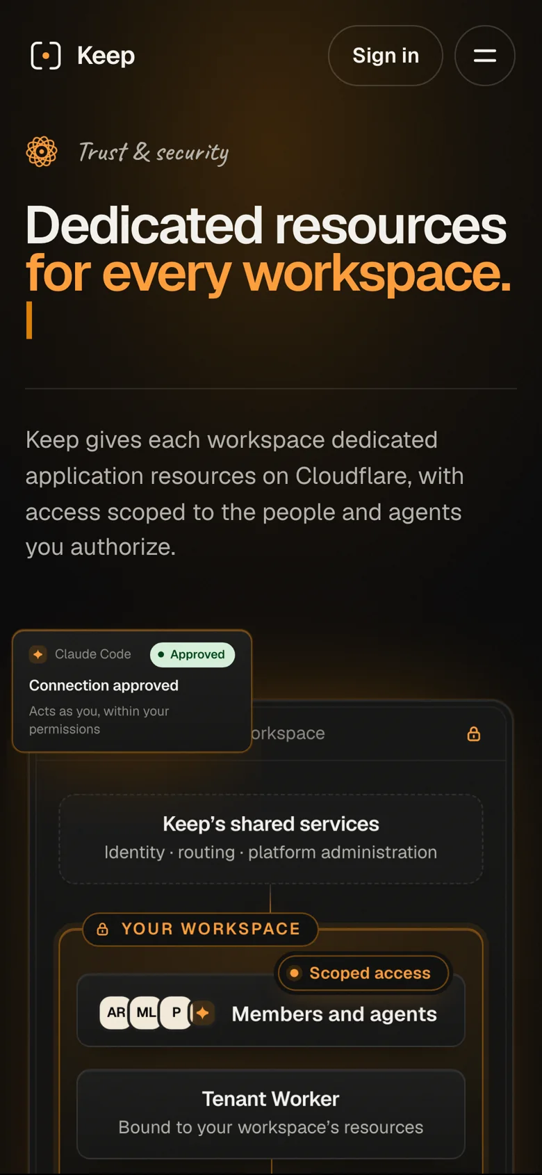
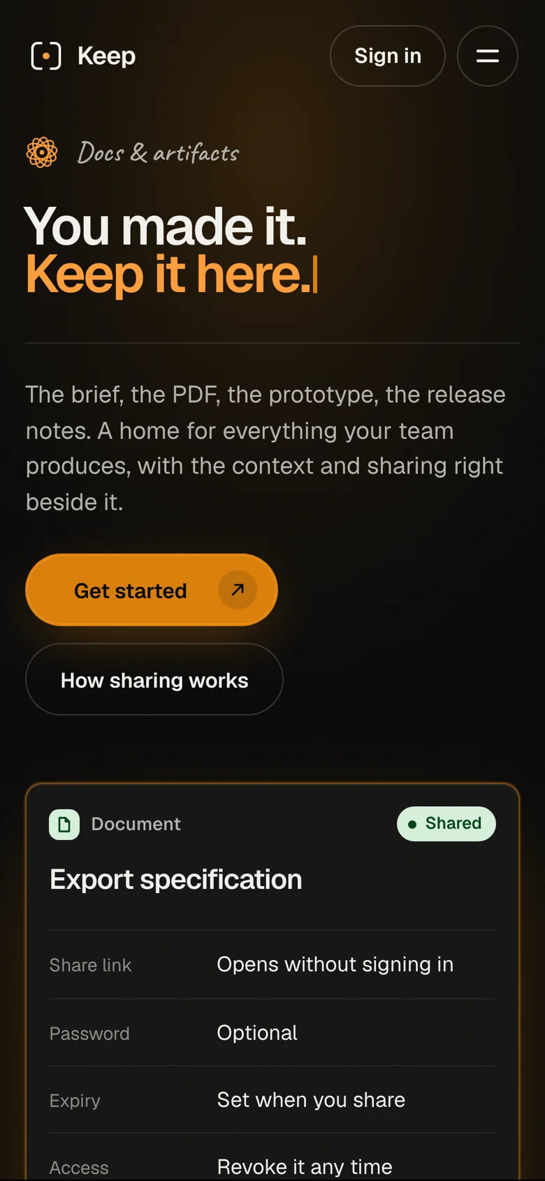
Shared components carry the design into each page.
Design implementation
Recorded app films show the interface rather than a separate set of marketing mockups. The capture documentation records a refresh for the v2.6 interface; future product changes still need a new recording pass. Shared type, surface, and spacing rules carry the website across its pages. The documented accessibility and layout checks cover specific viewports; the visual system remains shared across the pages.
Credits
Team
- reDesign Website design, UI implementation, and product films
- reLabs Engineering and release
Built with
- Astro, one React island
- Cloudflare
- Playwright for the films
- Claude and Claude Code
Next project: Vulkro
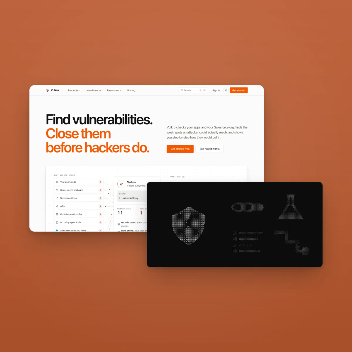 Vulkro. A security website connecting illustrated attack paths with evaluation details